A letter logo usually represents a business, or at least the name of a business. Many big companies like Google, Facebook, and WordPress use their first initials in their logo icons.
Okay, I want to stick with the WordPress theme that I am creating for this blog, so in this tutorial, I’m going to show you how to create a WordPress-style icon/logo. You know, making a logo is not easy, so I’m going to break it down into two parts: the shape part, and the text part.

Follow the steps below!
Note: All screenshots are taken from the Adobe Photoshop Mac version. Windows or other versions can look different. Windows users can change the Command key to Crtl and the Option key to Alt.
Table of Contents
Part 1: Shape & Outline
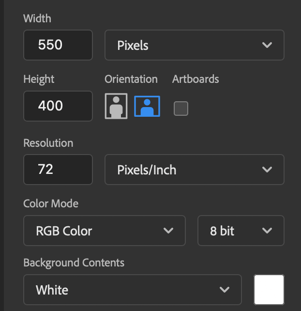
Step 1: Create a new blank document in Photoshop. You can choose any size you want because the logo will be a vector, which means you can scale it later without losing its quality. I’ll set my canvas size as 550 x 400 pixels. Feel free to do the same.
Step 2: Use the Ellipse Tool from the toolbar and draw a circle on the center of the canvas. Hold down the Shift key while dragging the mouse pointer to make a perfect circle.
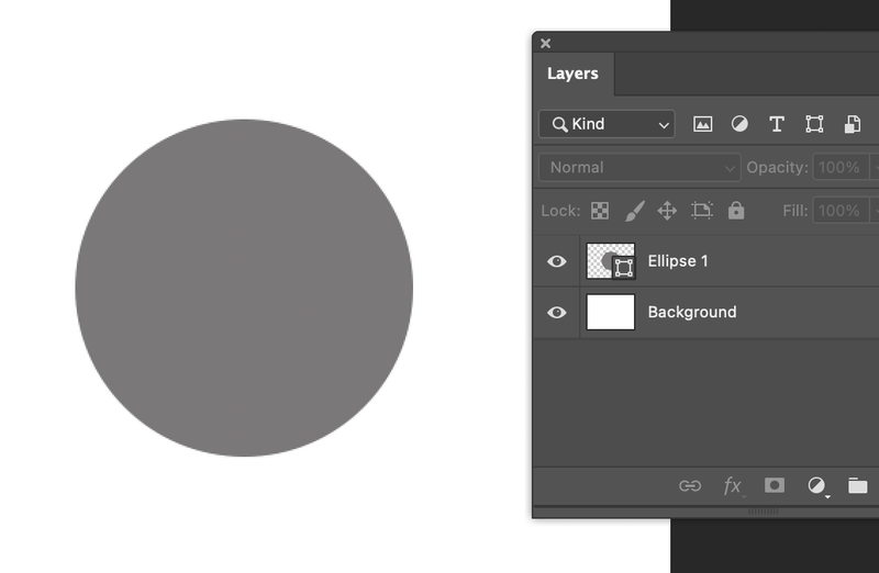
Step 3: Select the Path Selection Tool from the toolbar, click and drag the mouse pointer across the circle to select.

With the circle selected, press Command + C to copy, and Command + V to paste on the same layer.
Step 4: Activate the Free Transform Tool (Command + T), hold down the Shift and Option key, click and drag the pasted circle toward the center point to decrease the size in proportion.
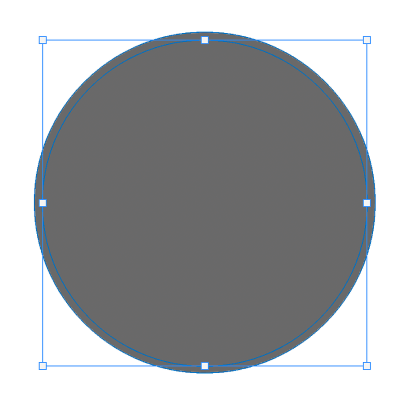
Hit the Return/Enter key when you’re happy with the new position.
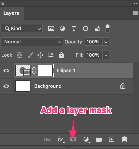
Step 5: With the inner circle selected, add a layer mask.
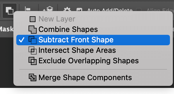
Step 6: Select the inner circle, go to the top toolbar, and select Subtract Front Shape.
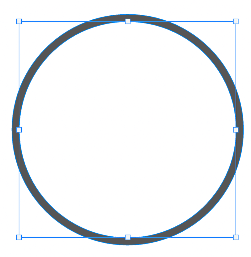
Your circle should look like this now.
Step 7: Use the Path Selection Tool to select the outer circle, copy and paste.
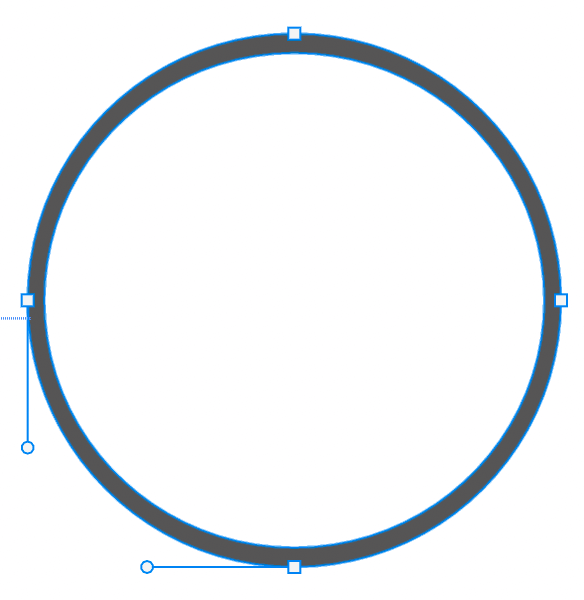
The new circle will cover the white area because you made a copy of the outer circle which is the same size as the outer circle, and larger than the white area.
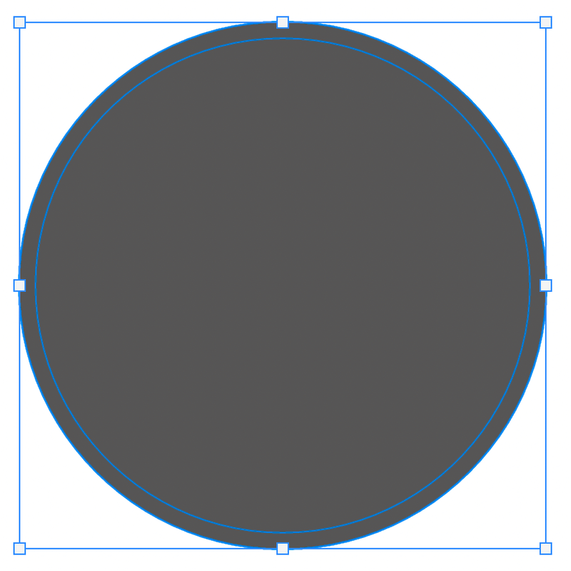
Use the transform tool to resize it, smaller than the white circle. The result should look something like this:

It’s starting to get the feeling of the WordPress logo now. There are just a couple more steps to finish the outline and shape, then we can move on to work on the font & lettering part.
Step 8: Select only the inner circle and copy it. Create a shape layer and paste it on the shape layer.
Quick tip: You can select any shape tool and draw it on the canvas to create a shape layer. It doesn’t matter what size or shape you draw because it’s simply for creating a shape layer and you will delete the shape later, leaving only the circle.
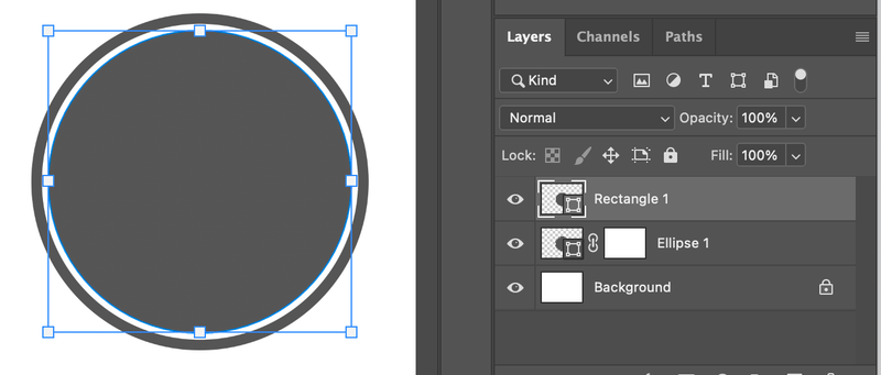
Ok, now we can finally start working on the logo font.
Part 2: Font & Lettering
Step 1: Use the Horizontal Type Tool (by default) to type in the letter(s) you want to use for your logo. The type layer should be on top of the shape layers.
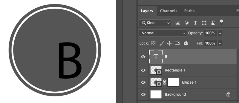
Right, that doesn’t look good at all. So the next step is to make it look nice.
Step 2: Choose a font and set the size of the letters. The letters should ideally fill the central area and overlap into the white area but not the outer circle. I’ve chosen the font Champignon Alt Swash (It’s free!).

Step 3: When you are happy with the size and look, right-click on the text layer, and choose Convert to Shape.
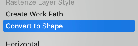
The letter B should be converted to a vector shape, which means you can no longer change its font. You’ll be editing it as a vector shape.

Tip: If you’re not 100% sure yet, duplicate the layer and hide it just in case you want to edit it again.
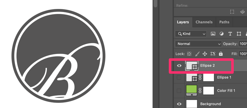
Step 4: Select the Letter layer, copy, and cut. The B layer would disappear. Then click on the inner circle layer (Ellipse 2), and paste the letter B.
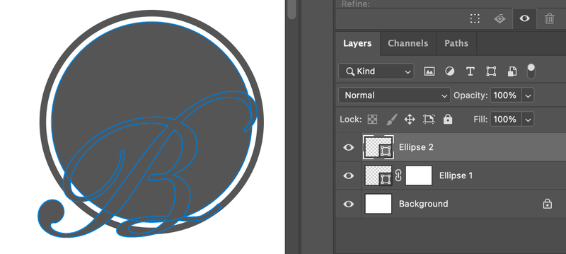
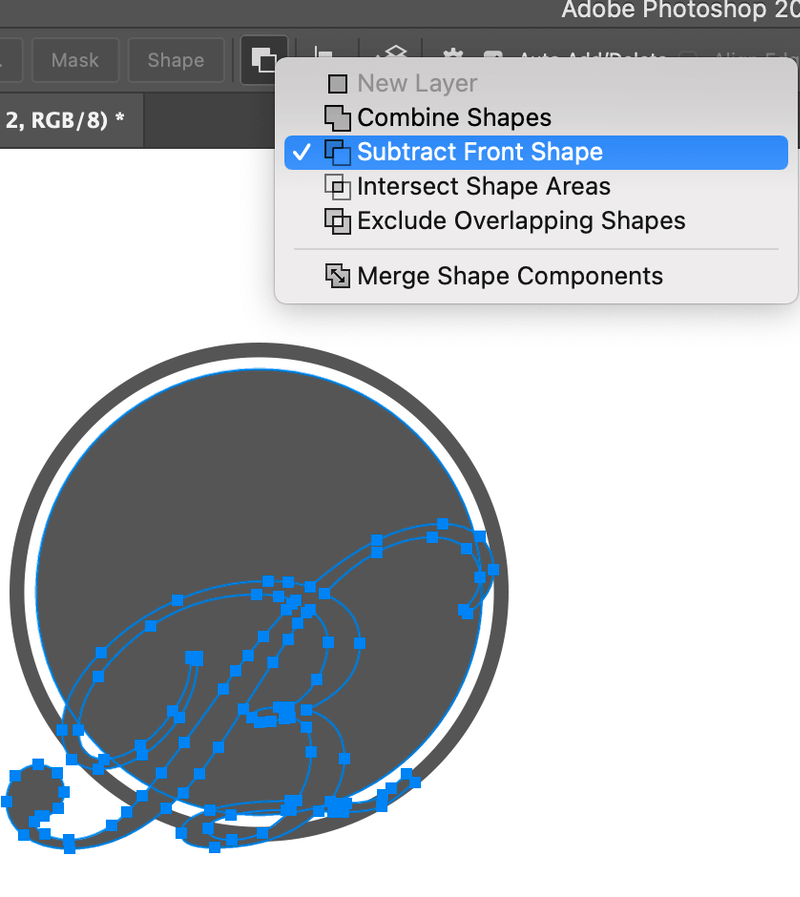
With the letter B selected, select the pen tool, go to the top menu, and select Subtract Front Shape.
It’s going to look like this.

I know you probably can’t tell the difference. But if you add a solid color layer underneath. You’ll see that the letter part outside of the circle is gone.
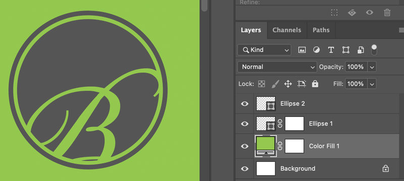
Yup, we are almost there. The last step is to combine everything into one layer.
Step 5: Use the Direct Selection Tool to select the smaller outer circle (the white circle). Hold the Shift key to select all anchor points, copy, cut, and paste on the Ellipse 2 layer.

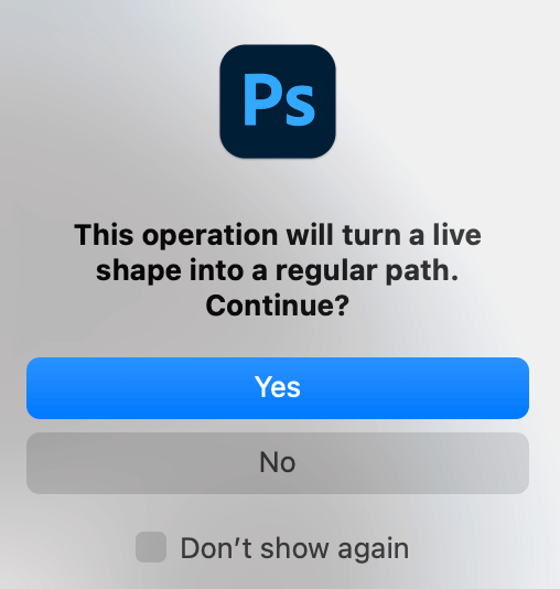
Now, you’ll see a window message when you cut the shape, click Yes, and you’ll see a solid circle.
When you paste on the circle layer, you might not be able to see the outline. You can hide the bottom layer (Ellipse 1).
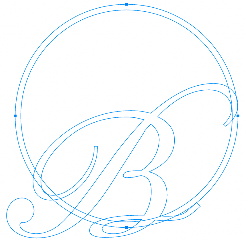
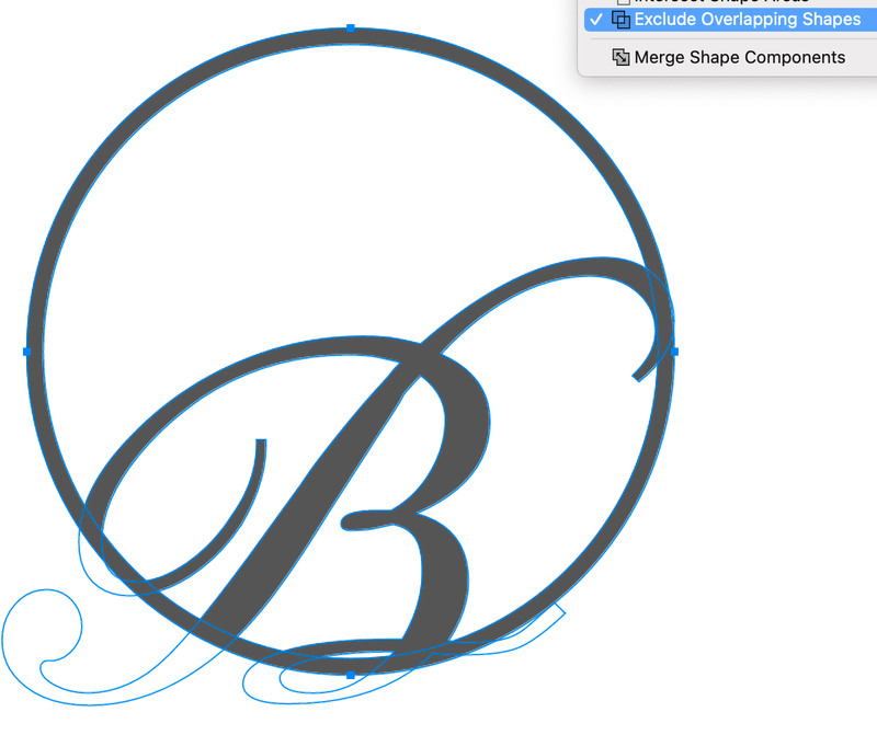
Select the Pen Tool, and select Exclude Overlapping Shapes.
Turn the visibility of Ellispe 1 back on and follow the same step to add the outer circle to the Ellipse 2 layer.
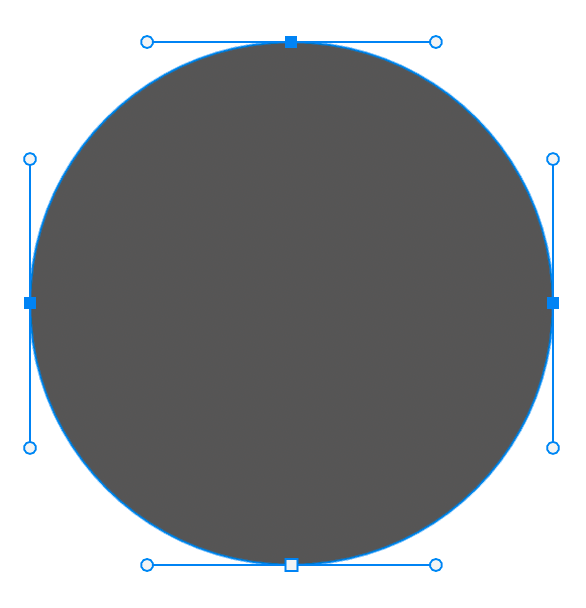
Select the last outer circle using the Direct Selection Tool, copy, cut, and paste to the Ellipse 2 layer.
Choose the pen tool and Select Exclude Overlapping Shapes. Now everything should be on one layer. Now when I hide other layers, everything is visible on Ellipse 2.
That’s it!
Creating a logo in Photoshop is all about manipulating layers. You have to pay attention to which layer you’re working on. Detail matters.
The advantage of having all the shapes combined in one shape layer is that they will always stay in proportion to each other. And you can use layer styles such as gradients, color overlay, etc, and it will apply to the whole shape rather than just a part of it.

