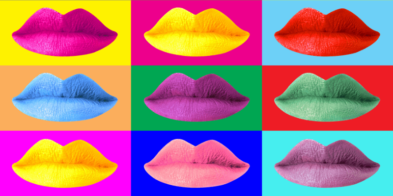
Pop art is the way to go if you want to give your images a big pop of color or tap into your inner Andy Warhol. Bold colors, which are a hallmark of pop art, will stand out in any photograph.
The brilliant colors and bold shapes of the 1960s pop art movement are well known. The most important part of pop art is choosing the pop art colors.
I’m Aly, I am Adobe Photoshop certified and have been using Photoshop for over five years. In this article, I will be showing you how you can create an Andy Warhol-inspired pop art Photoshop in 11 steps.
Key Takeaways
- You will learn how to make layer groups and use layer adjustments.
- Higher contrast images will work best for this filter.
How to Make a Pop Art Filter on Your Image
Follow the steps below to learn how to create an eye-catching, Andy Warhol-style filter in Photoshop.
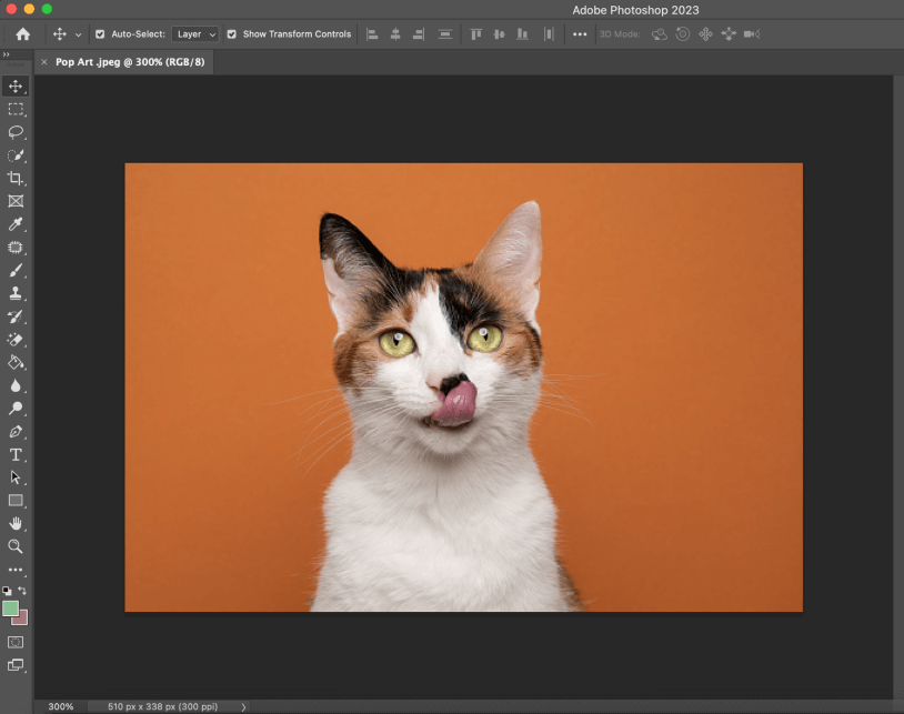
Step 1: Open the selected image you want to use for this filter in Photoshop. As I mentioned, higher contrast images work best for this filter due to their defined light and dark areas.
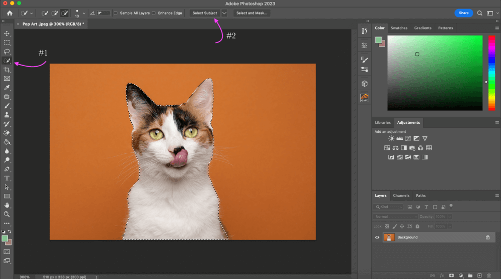
Step 2: Select the Quick Selection tool from the toolbar. The window’s top select subject button should be clicked. Around your subject, a line of marching ants will appear.
Using the Quick Selection tool, you can hone the selection. Simply click an area to add it, or option-click to remove it.
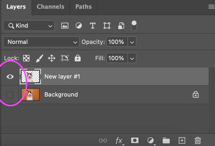
Step 3: We will now need to duplicate your layer. When your subject is selected, press Command + J to duplicate it on a new layer.
Alternately, go to Layer > New > Layer Via Copy. You could call it new layer #1. You should now have the original layer as well as a new layer #1 with your subject.

Step 4: To the left of your Background layer you will see a little eye icon, go ahead and click that so it doesn’t show anymore. What this will do is hide it without removing it, in case we need to return to it at any time.
Step 5: We must make our photo into a two-tone image in order to achieve the pop art look. Go to Image > Adjustments > Threshold with “layer 1” selected.
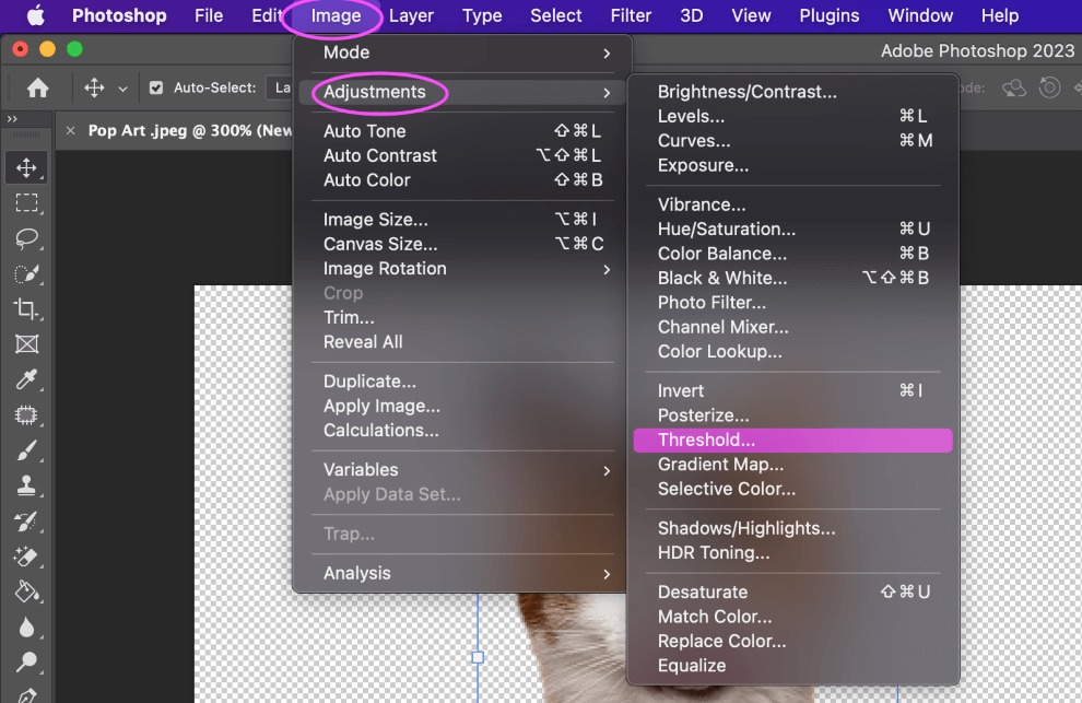
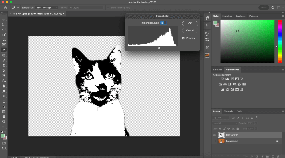
Step 6: A pop-up window displaying your image’s histogram will appear as a result. To correctly expose the image, use the slider to select the brightness level.
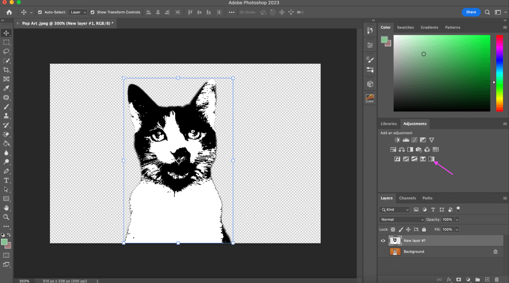
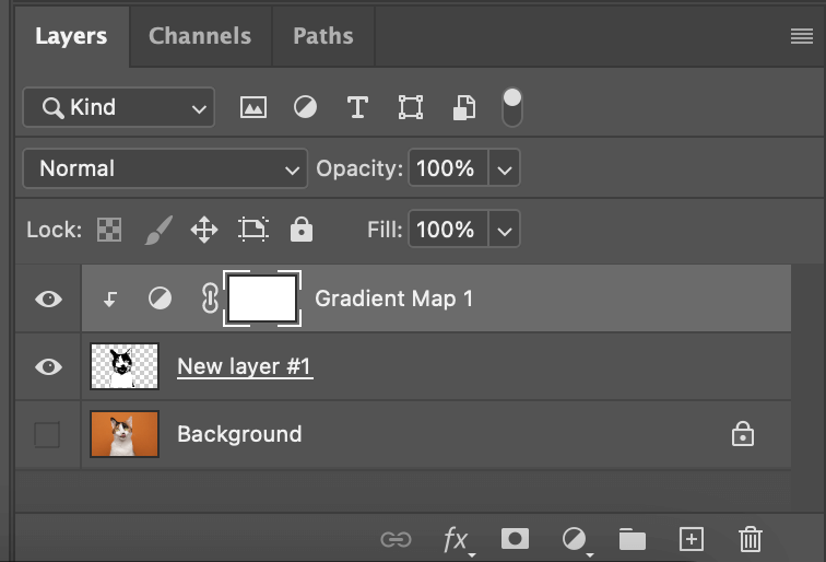
Step 7: In the Adjustments panel, select the gradient map icon. A new “gradient map adjustment” layer will be added above your topic on “layer #1” as a result. Without really modifying the layers, adjustment layers alter how you see the layers beneath them.
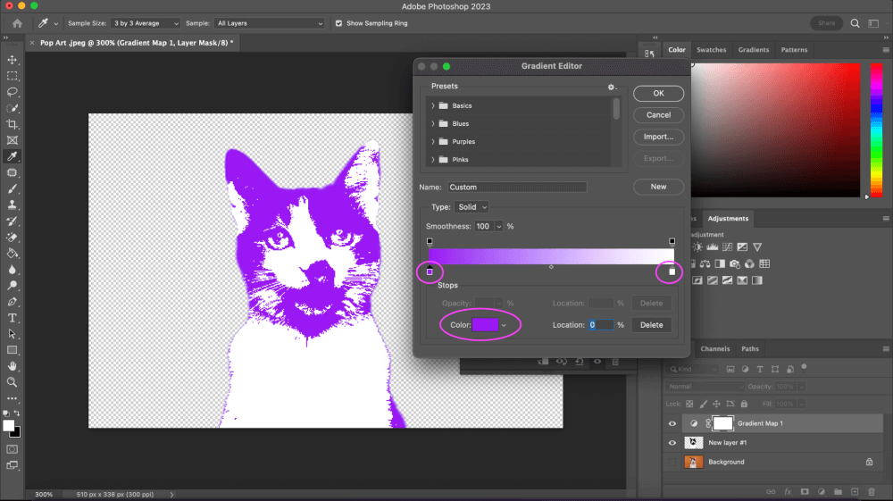
Step 8: To use the Gradient Editor, click the graduated bar in the Properties window. Color stops are the squares that are located beneath the gradient bar. Numerous color stops with various hues can be present in a gradient.
We’re going to stick with two. Use the color selector by clicking the black “color stop” on the left-hand side to select a color.
To select a different color, click the “color stop” on the right and utilize the “color selector.” The first color you chose will now be visible on any black sections of your subject. Any white items will appear as the second color.
To modify your color choice, return to your gradient map controls whenever you like.
Step 9: While holding down the Option/Alt key, move the mouse pointer across the boundary between layer #1 and the gradient map layer.
Click to append (or attach) the “gradient map” to “layer #1” when the cursor transforms into a square with an arrow coming out of it. This means that any adjustments you make to the “gradient map adjustment” layer will only have an impact on “layer #1.”
Another way to do this is to make a clipping mask. You can do this by right-clicking on the “gradient map adjustment” layer until you see “make clipping mask” and you click that.
Step 10: After coloring our image subject, we must create a background that contrasts with it. Click the new layer icon while selecting the “background” layer. This will add a new blank layer below your topic on “layer #1” and above the “background” layer. I am going to name mine “New Background.”
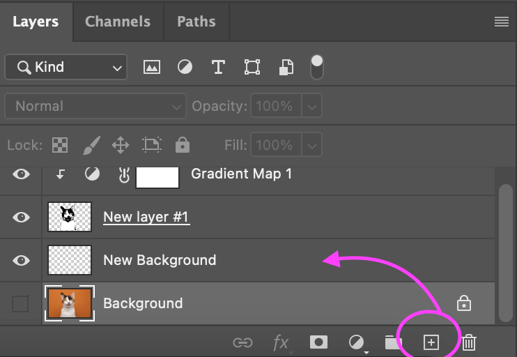
Step 11: Next, the Tools palette is where you can choose the Paint Bucket tool. Click anywhere on the blank “New Background” after choosing your backdrop color.
The end is here! You just created a pop art effect inspired by Andy Warhol using Photoshop. These instructions can be used to create your own pop art Photoshop action, which you can then use on whatever photos you like.
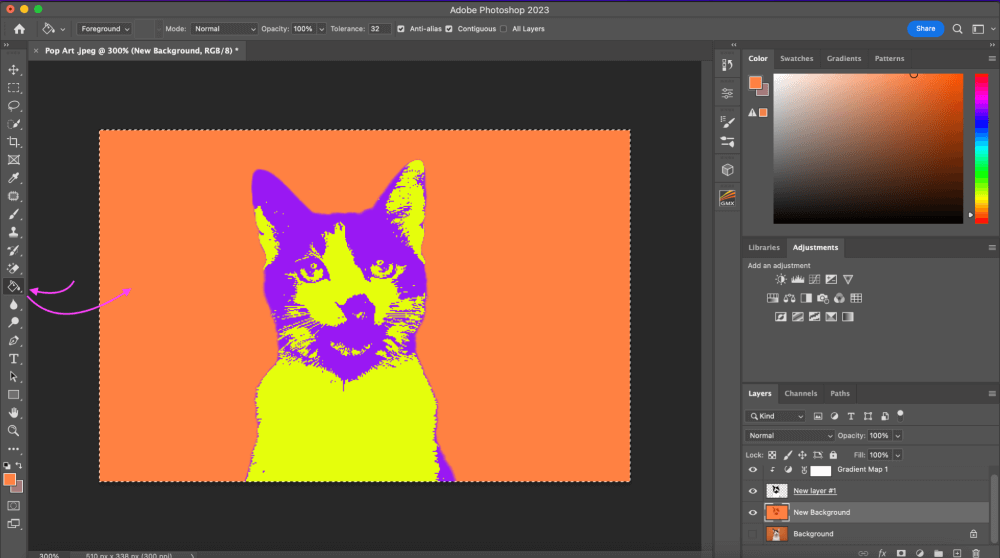
Play around with bright color options, although pastel colors do work, if you want a “true” pop art filter opt for bright bold colors.
Final Thoughts
You’re now a color pop art pro! This is one of my all-time favorite filters to create since there are so many different ways you can make a pop art image look, and it’s super easy as well! I hope you enjoyed this article learning about creating pop art and all that goes into it.
Any questions about creating a pop art filter on an image in Photoshop? Leave a comment and let me know.
About Aly Walters