Photoshop is best known for its ability to create seamless photorealistic adjustments, but over the years, Adobe has packed in a lot of other functionality. Photoshop has a Type tool, of course, but if you dig into the Character and Paragraph panels, you’ll find some fairly sophisticated typesetting tools for typographic design.
If you have a lot of typesetting to do, you might be better off using a program like Illustrator or InDesign, as they have a lot more type-focused features for long text passages. Photoshop excels at many tasks, but it’s better suited to editing pixel images rather than typesetting.
Table of Contents
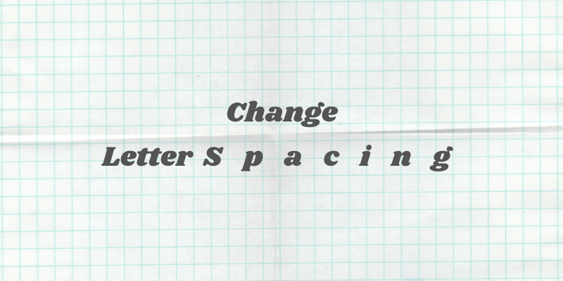
The Quick Guide to Changing Text Spacing in Photoshop
Step 1: Open the Window menu and select Character.
Step 2: Switch to the Type tool and select your text layer.
Step 3A: To adjust the spacing between two letters, click to place the type cursor between them and adjust the kerning setting in the Character panel.
Step 3B: To adjust the spacing between every letter in a text box equally, select the text and adjust the tracking setting in the Character panel.
If you’re already familiar with typesetting terms, that’s probably all you need to get going. If you’re new to the world of typography or you want a bit more of a detailed explanation of the Character panel and how to use tracking and kerning, read on!
Typography Basics: Tracking vs Kerning
Before we get to the detailed guide, it’s worth taking a moment to explain a couple of basic typography terms.
Tracking and kerning are the two methods used to change letter spacing in Photoshop and any other program that has advanced typographic controls.

Tracking is used to adjust all the letters within a piece of text at once while kerning gives you control over the spacing between two individual letters.
Many typefaces (especially the ones found in Adobe Fonts) have custom kerning pairs set by the designer. These are used by default when the kerning setting is set to Metrics.
These usually cover specifically problematic letter pairs, such as when a capital V is set next to a capital A.
Without any kerning, the computer would create a very noticeable and odd-looking space between the two letters, but by reducing the kerning between you can create a much more pleasing layout.
Most Adobe software also has an Optical kerning setting, which attempts to apply kerning automatically based on the shape of the letterforms, mimicking what a graphic designer might do by hand to individual letter pairs.
It doesn’t work perfectly in every situation, but it may provide the result you’re looking for – or at least a good starting point for hand-kerning any trouble spots.

You can apply custom kerning to every letter pair individually, but it can take a long time to get right, so it’s generally only used for limited text applications like the company name in a logo design, book cover titles, and headlines (or making silly examples, see above).
Beware when you start to learn about kerning, however. Once you start paying attention to the kerning in your own projects, you’ll start noticing it everywhere – and most of the kerning in the world is very badly done! It’s actually something of a running joke among typographers and other graphic designers.
The Detailed Guide to Letterspacing in Photoshop
If you’re aware of the risks (only joking… [sort of…]) and you want to keep learning about letterspacing in Photoshop, here’s how to apply tracking and kerning in your project.
Step 1: The Character Panel
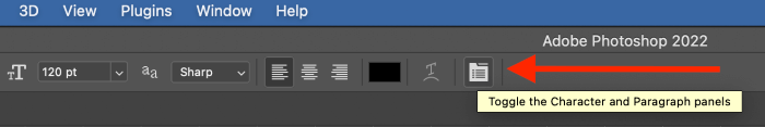
The Character panel is the control center for your typographic design adjustments, but it’s not always enabled by default. To bring it up, open the Window menu and select Character.

Photoshop will open it along with the Paragraph panel, as they’re often used together.
You can also bring up the two panels using the shortcut in the tool options panel when you’ve got the Type tool selected (see below).
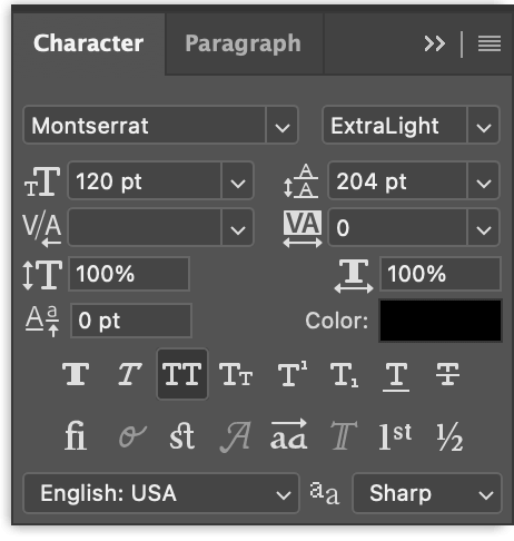
The Character panel can be a bit confusing at first since there are a lot of icons packed in a small space. With a bit of practice, you’ll get used to it!
Step 2: Selecting Your Text
Switch to the Type tool, and select your text layer (or use the Type tool to create your text, if you haven’t already).
If you want to use tracking, which applies equal letterspacing to every character, you simply need to select your text layer. You can also apply kerning to a portion of the text within your text layer by selecting it with the Type tool text cursor before adjusting the tracking setting.
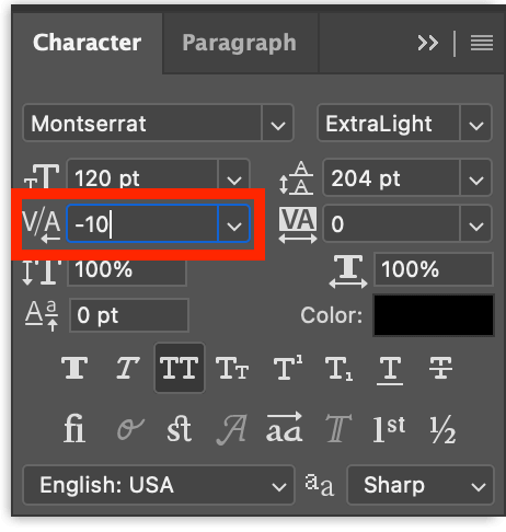
If you want to use kerning, you’ll have to place the Type tool text cursor between the two letters you want to adjust.
If you try to apply kerning to a whole text layer or selected letters, the process simply won’t work unless you’re setting it to use the automatic methods: Metrics, Optical, or 0 kerning.
Step 3A: Applying Tracking
It’s definitely more work to set up the process than it is to actually use it! Once you’ve got your text selected, you can use the tracking dropdown menu in the Character panel to apply a preset amount of tracking, or you can enter a custom value with your keyboard.
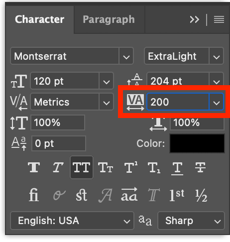
When adjusting tracking, you’ll find that you can dramatically affect the total length of your text area while still keeping it legible. Even though it is only a small space being added or removed between each letter, the effect multiplies quickly over longer text passages.
Step 3B: Applying Kerning
Applying kerning can be a lot more time-consuming, and it can quickly drive you to frustration. It’s easy to adjust, but it can also be hard to tell when it’s exactly right, especially for those who are just getting into the world of typography.
That being said, a kind of meditative serenity can also be found in it – it’s really all about how you approach it.
With your Type tool text cursor placed between the two letters you want to adjust, use the dropdown to set a custom kerning amount. You can also enter a custom value with your keyboard, or use the up and down arrow keys to adjust the value in increments of 10.
As I mentioned earlier, you can also try applying one of the two automatic kerning methods, Metrics or Optical. These options work more like tracking and can be applied without placing the cursor between each individual letter pairing. Both are listed in the kerning dropdown menu in the Character panel, as well as the option to set the kerning to 0 for every letter pair.
Typically, Metrics or Optical will be fine, but you can always use them as a starting point and then fine-tune any problematic letter pairs by hand.
A Final Word
That’s all you need to know about how to change letterspacing in Photoshop, and hopefully, you’ve got a better understanding of some basic typographic terms and functions. Learning the basics of typography isn’t too hard, but it can be the labor of a lifetime to refine your eye and your sense of typographic style.
There are plenty of great typography resources available on the web to help you polish your skills, so get out there and start practicing!
Happy typesetting!
About Thomas Boldt