As a photographer, I’m a big fan of bold colors. I love vibrant images with colors that seem to leap off the page at you. But if you’ve ever tried to enhance colors in Photoshop, you’ve probably discovered how easy it is to overdo it.
Hey there, I’m Cara! There’s real art to enhancing color in Photoshop without making your image look overly edited. There are several methods and which one works best will depend on your image. Sometimes you may find the best results with a combination of these techniques.
So let’s take a look at how to make colors pop in Photoshop!
Note: I use the Windows version of Photoshop. If you are using a Mac, the workspace will look slightly different from the screenshots displayed here.
Table of Contents
Method 1: Desaturate/Saturate
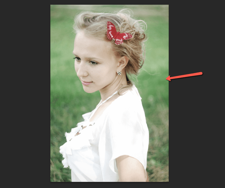
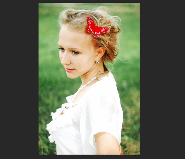
To demonstrate this method, I downloaded this portrait of a young woman from Pixabay.com.
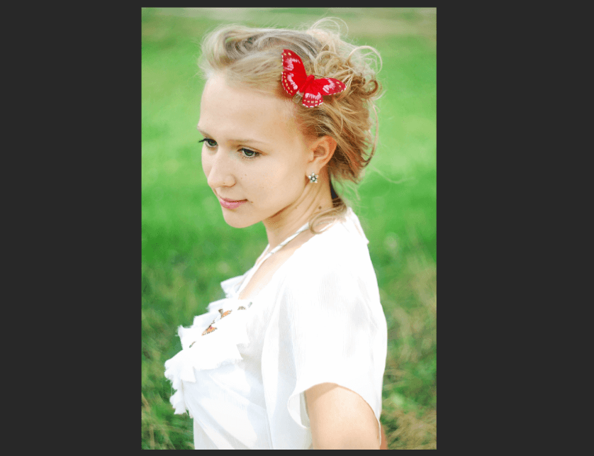
The colors are already somewhat vibrant, but in my opinion, they are competing with one another. The green almost looks overdone and draws the eye away from her rather than toward her.
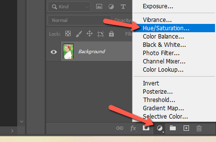
In cases like this, where you would like the background to recede, let’s start by desaturating the image. Click the little half-filled circle icon at the bottom of the Layers panel to open the Adjustment Layers menu. Choose Hue/Saturation.
In the Properties panel, leave the box set to Master and bring the overall saturation of the image down.
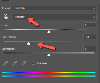
In this image, I’m mostly interested in toning down the greens significantly.
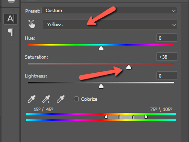
Now let’s add a second Hue/Saturation Layer. The colors of our subject are mostly yellow and red. Let’s choose the yellows first and bring the saturation up. Then do the same with the reds.
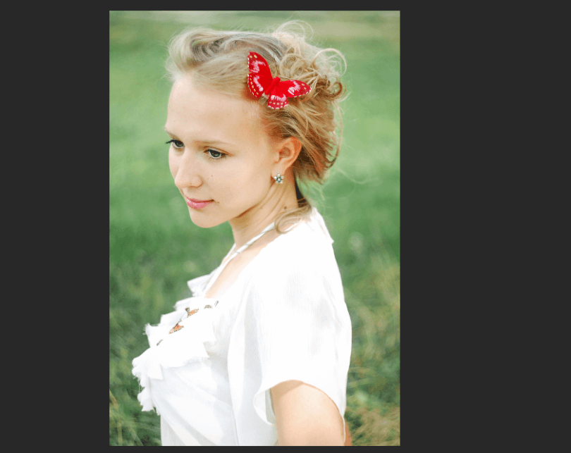
Now, this is looking pretty good (better than the beginning, in my opinion). However, if we look closely, all we’ve really done is fade the background. It makes her seem more colorful because she isn’t competing with the green as much.
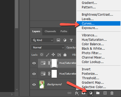
But what if you want a little something extra?
Method 2: Curves
Let’s try enhancing the colors by boosting the contrast in the image. Click that half-filled circle again, but choose Curves this time.
In the Curves Properties panel, try bringing down a point near the black end while bringing up a point near the highlights end.
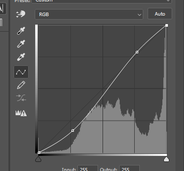
It doesn’t take much to get a stunning result like this.
You can also separate the Red, Green, and Blue channels to work with colors individually.
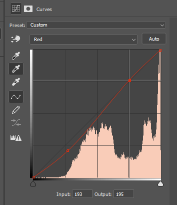
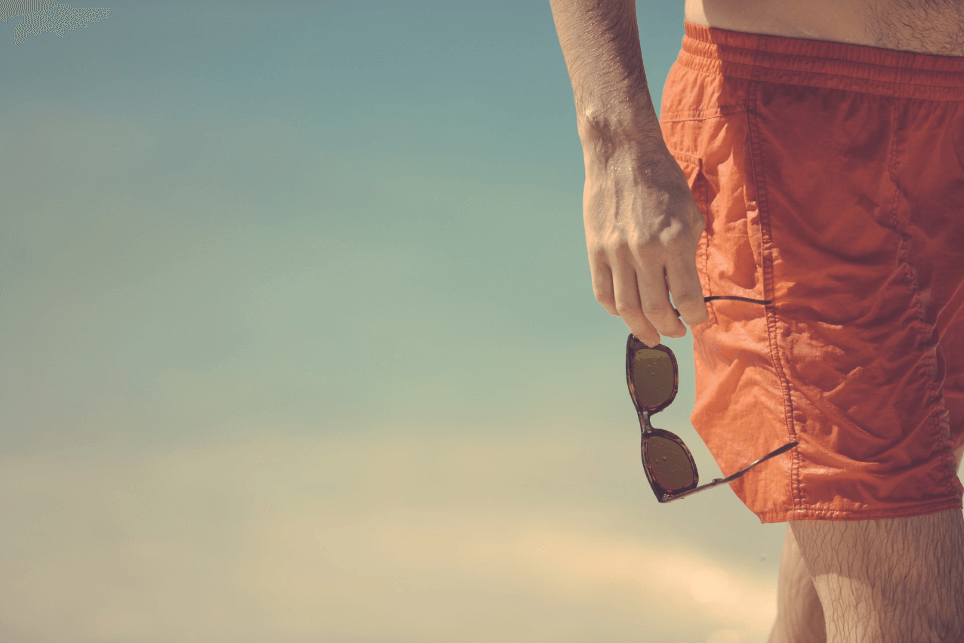
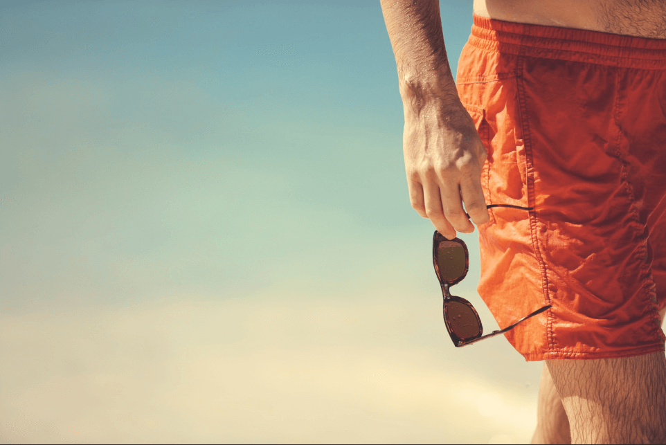
Here’s another quick example. The original image is quite washed out, though this color combination could be exciting.
Here are the adjustments I made with just the curves tool. The white line is the main RGB line. The blue and the green lines appear because I made slight adjustments to those channels as well.
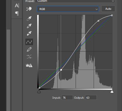
Now, look at the result. Way more colorful without looking overdone!
Method 3: Camera Raw Filter
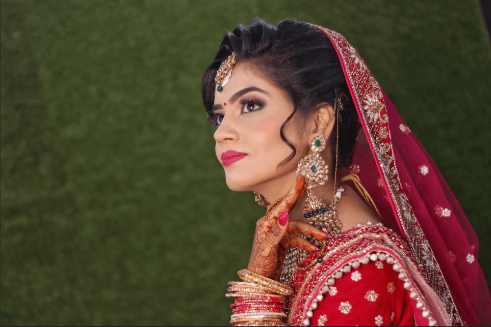
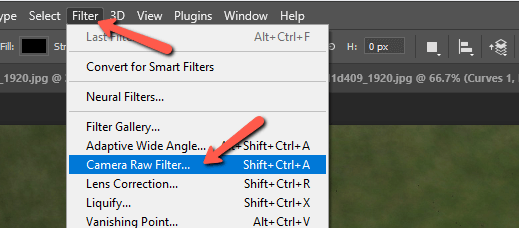
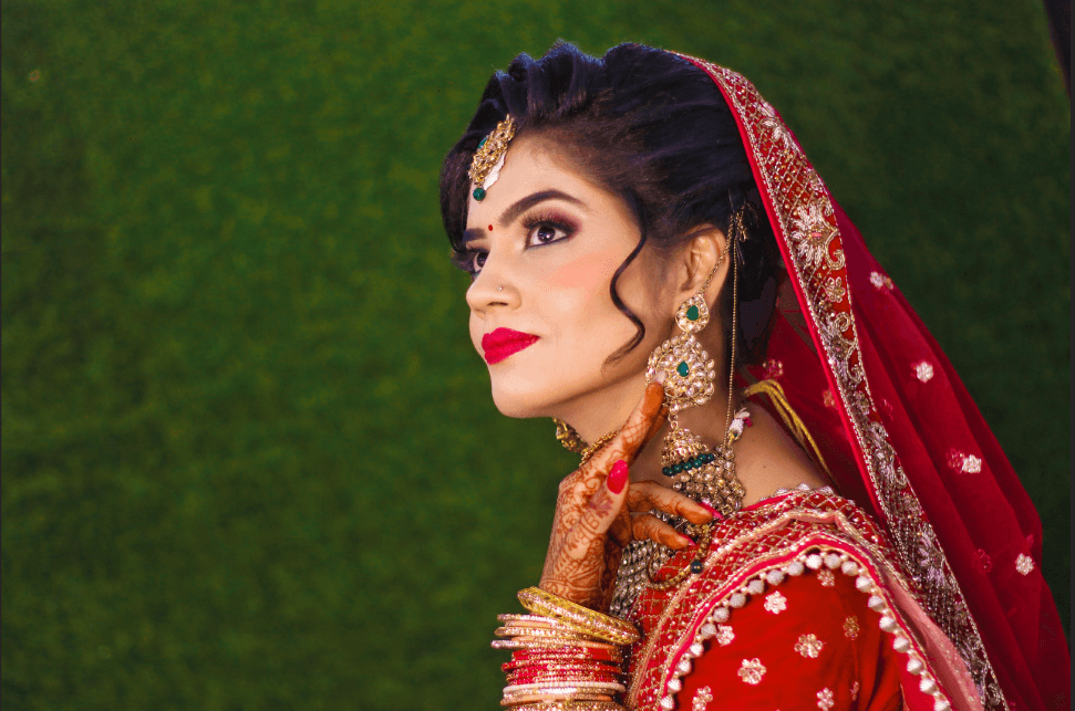
Are you a fan of Lightroom? You’ll find this method feels comfortable to you. We’re going to try the Camera Raw filter with this image of an Indian bride I got off Pixabay.com.
Go to Filter in the menu bar and choose Camera Raw Filter.
There are a few tools you can use here and they work similarly to the tools available in Lightroom.
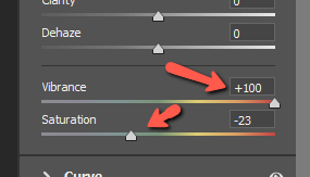
Let’s start by pushing the Vibrance in the Basics panel, and I’m going to go crazy and push it to 100. Obviously, that’s too much and we’ll counteract it a little by bringing the Saturation down a little.
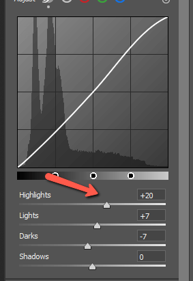
Moving down to the Curve section, I’ll adjust the highlights and shadows to add contrast, much like we did with the Curves tool in Photoshop.
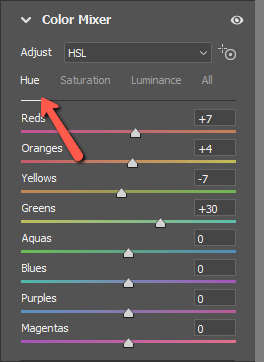
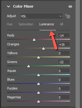
But this next section is the real gold in Lightroom. Move to the Color Mixer section. This is like the HSL/Color panel in Lightroom. You get an individual slider for each color, plus you can control the Hue, Saturation, and Luminance of each color individually.
Here’s what I did with the hues.
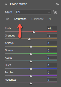
The saturation.
And the luminance.
And here’s my result. Much better!
Method 4: Color Balance
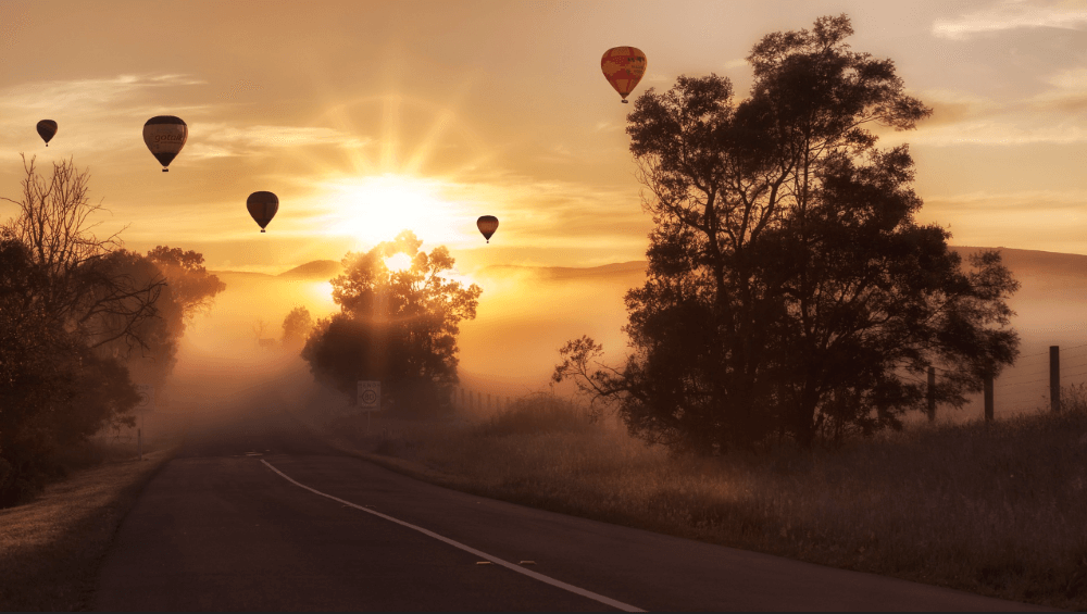
The Color Balance adjustment layer can be particularly helpful when working with sunrise/sunset images. It allows you to adjust the colors of the shadows, midtones, and highlights separately.
Let’s look at this image.
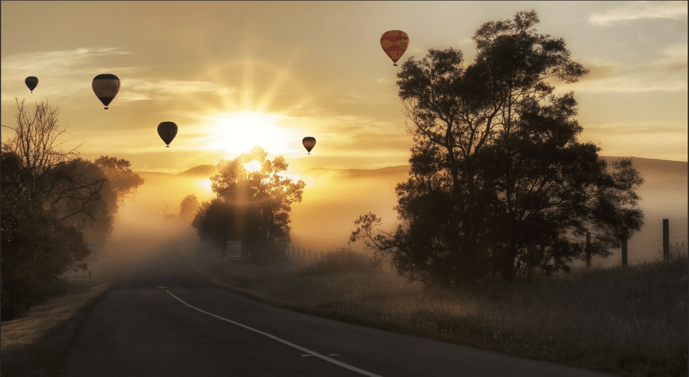
Choose which tone you want to work with in the dropdown box at the top. Then adjust the sliders as you see fit. For this sunrise image, I want to push the warmth, so I’ll slide down into the yellow and magenta and push things up in the red a little.
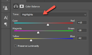
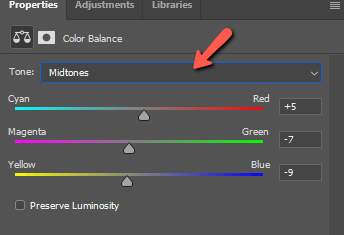
Here is what I did with the midtones
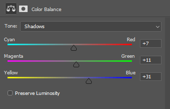
And the shadows.
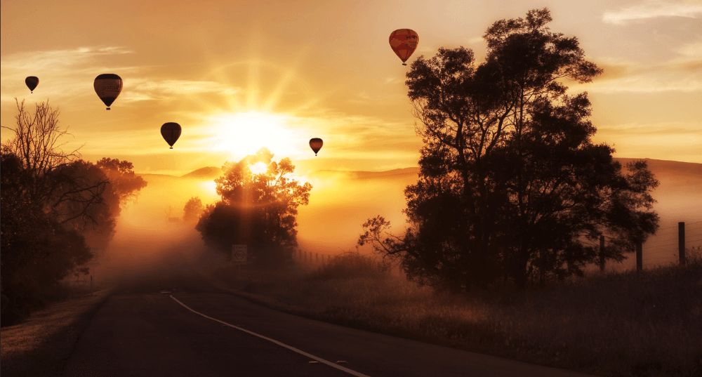
And here’s the result.
Then, I would add a touch of contrast with a Curves layer for this final result.
As you can see, there are lots of ways to make colors pop in Photoshop. The methods you use will depend on your images and the style you prefer.
The fun part is that you get to explore and develop your style until you make it your own – and you’ll make some amazing images in the process!
Curious about how to change colors completely in Photoshop? Check out this tutorial here.
About Cara Koch