If you want to add a new design strategy to your image editing toolkit, learning how to use duotones in Photoshop for your images is a great option.
You’ve probably seen duotone images around the web and in print, but they used to be extremely common in the early days of photography, typically using cyan or sepia along with black to create prints.
Fortunately, thanks to the power of Photoshop, recreating these effects is quite simple, and you can create even more striking effects by selecting contrasting colors.
The two tones used to make a duotone effect can be any combination you want to use, although some will be more successful than others, depending on the content of your image.
Table of Contents
What is a Duotone, Exactly?
As you’ve probably guessed from the name, a duotone image is made up of two colors instead of using a more standard three-or four-color model such as RGB (used for the screens on digital devices) or CMYK (used for print-based images).
Duotones tend to be much simpler and more cost-effective to print since only two color plates needed to be prepared instead of the standard four used by a CMYK image, although recent advances in printing technologies have changed the game a bit, so be sure to confirm with your local print shop in advance if you’re motivated by saving money on your prints.
It’s important to point out that there is a difference between a duotone-styled image and a true duotone image. While they might look similar on-screen, a true duotone requires a specialized file format and printing process in order to be genuinely reproduced as a duotone.
The process for creating each type of image is also a bit different, so let’s take a look at both options and the pros and cons of each method.
How to Create a True Duotone Image in Photoshop
To get started with a true duotone, you have to work from a grayscale image. There are a number of different ways to convert a full-color image into a grayscale image, but the two best choices are the Black & White adjustment tool and the Channel Mixer.
These tools give you total control over how the different colors of your image are represented when converting to grayscale, and you can create some interesting effects.
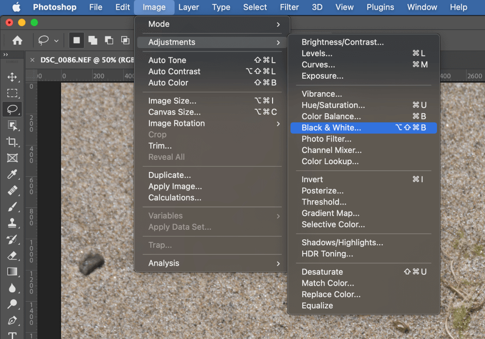
To use the Black & White adjustment tool, open the Image menu, select the Adjustments submenu, and click Black & White. You can also use the finger-bending keyboard shortcut Command + Option + Shift + B (use Ctrl + Alt + Shift + B if you’re on a PC).
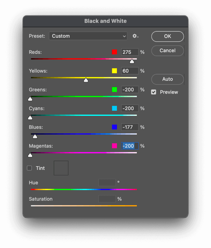
Adjust each slider to adjust the relative brightness of each hue until you’re satisfied. If you can’t quite get the right results using this conversion, you might have better luck by using the Channel Mixer adjustment instead.
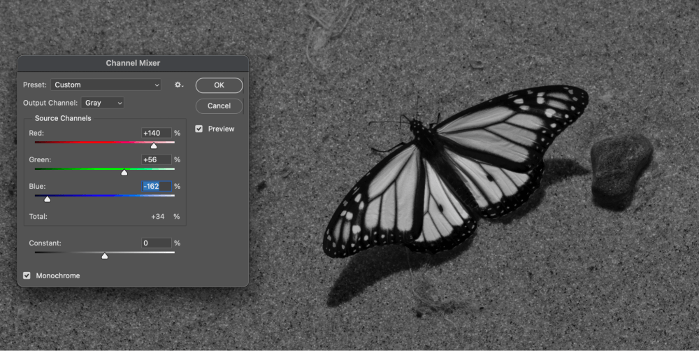
Open the Image menu, select Adjustments, and click Channel Mixer.
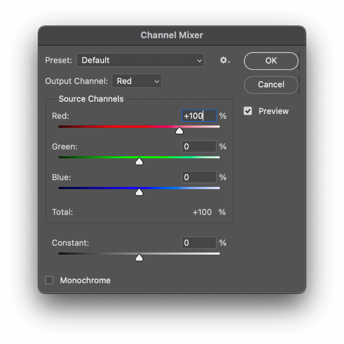
Start out by checking the Monochrome box at the bottom of the window, and then experiment with different combinations of the Source Channels sliders until you’re happy with the effect.
In my example, the orange of the monarch’s wings has now become a bright white, thanks to a hugely boosted Red channel and a strong negative setting for the Blue channel.
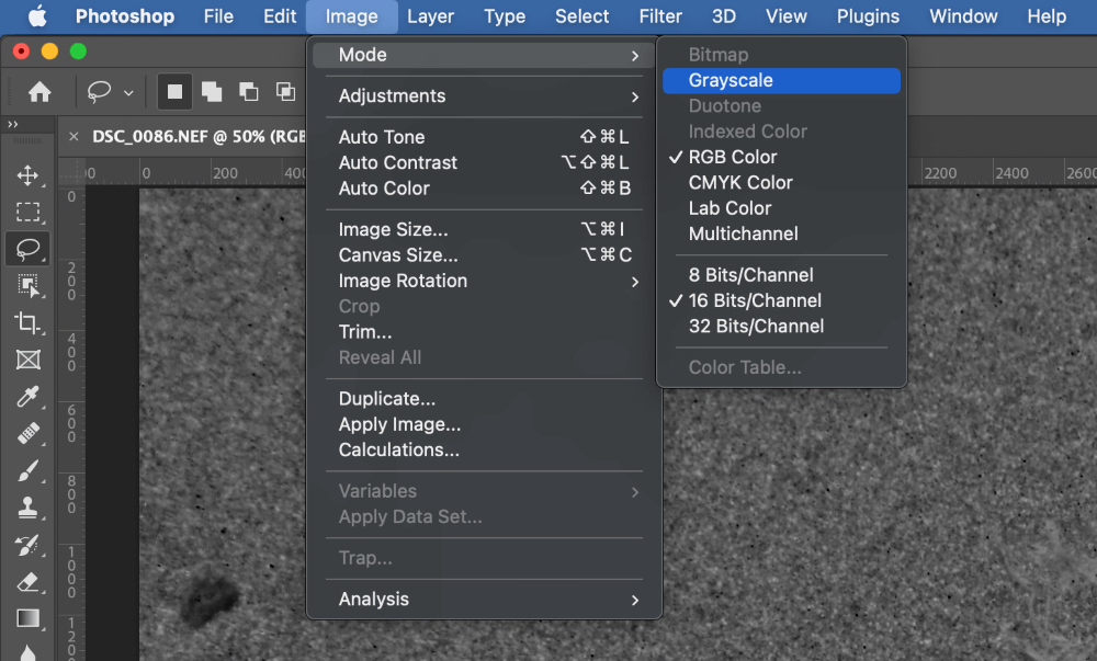
If you just want to skip this step and simply discard all color information, open the Image menu, select the Mode submenu, and click Grayscale.
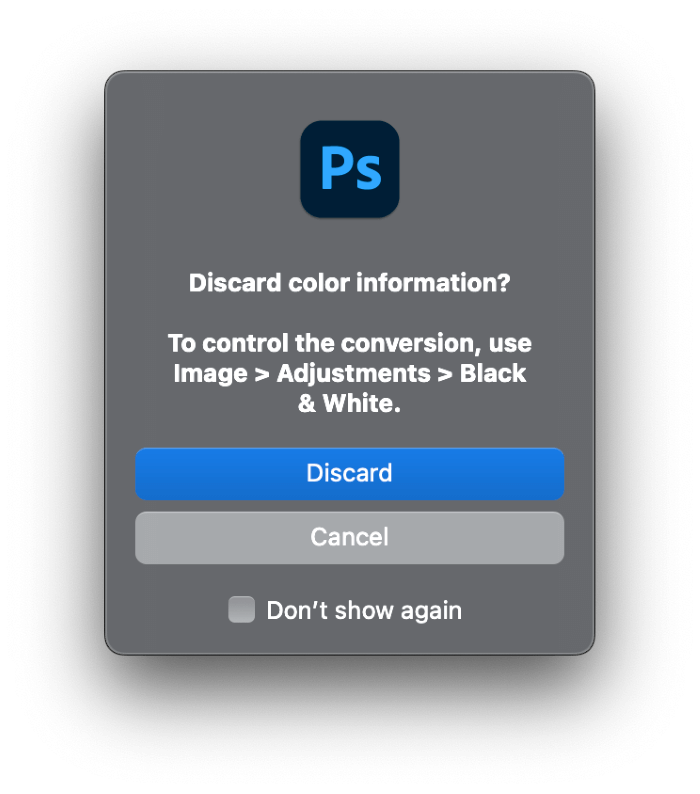
Photoshop will warn you about discarding all color information. Click Discard and your image will be converted into a single-channel grayscale image.
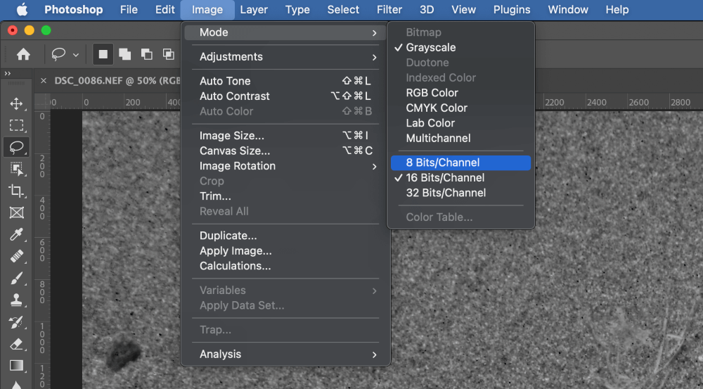
Depending on the source of the image you’re working on, you may also have to convert it into an 8-bit image instead of a 16-bit image. Open the Image menu again, select the Adjustments submenu, and click 8 Bits/Channel.
Once this last conversion step is completed, you should finally be able to use the Duotone color mode. Open the Image menu one last time, select the Mode submenu, and click Duotone.
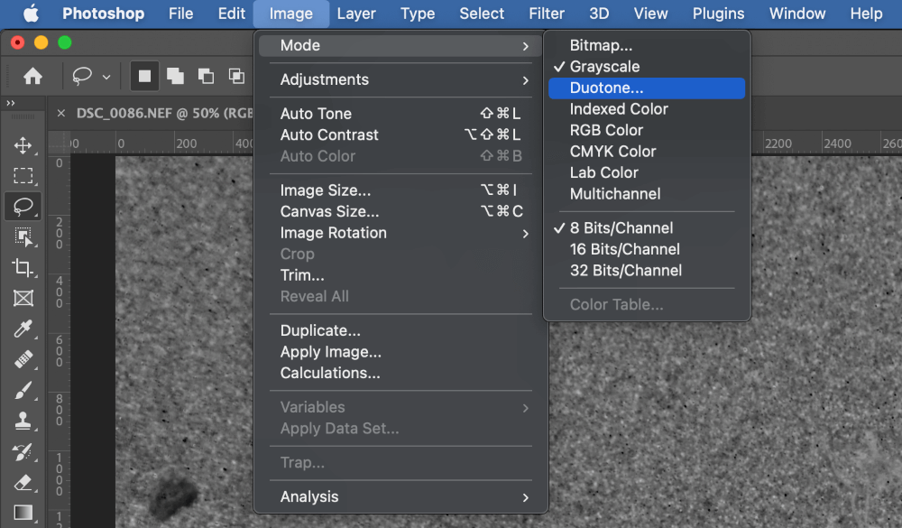
Photoshop will open the Duotone Options dialog, allowing you to specify the colors you want to use in your Duotone image.
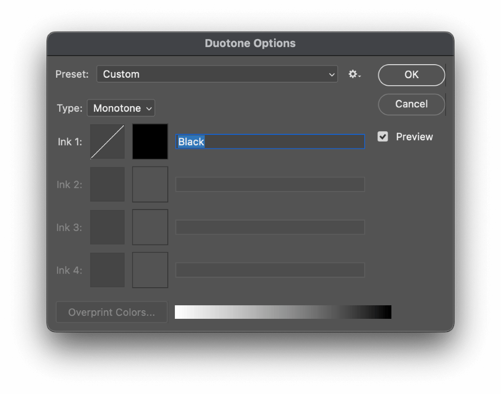
Open the Type dropdown menu and change it from Monotone to Duotone, and the list will update with additional ink color.
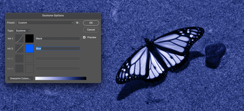
If you want to adjust things slightly, you can click the thumbnail beside each color swatch to adjust the response curves. These allow you to effectively perform a Curves adjustment on each individual color so that you can create the perfect effect.
Once you’re happy with the results, click OK and your duotone image is complete!
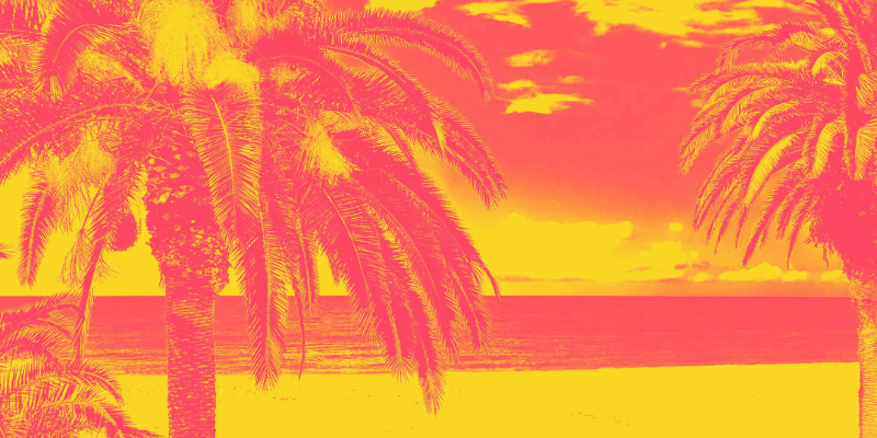
How to Create a Duotone Effect in Photoshop
As you may have noticed, the process of creating a true duotone isn’t too complex, but you have to throw away all your color information in the process, and if you ever want to print the image, you’ll need a specialized print setup in order to get an accurate result.
A lot of the time, creating a duotone effect is a better option. You get the stylistic look that you’ll find in a true duotone but you will retain all your color information – and you can even easily adjust or even scrap the effect at a later point if you want.
To get started with this method, open the Layer menu, select the New Adjustment Layer submenu, and click Gradient Map.
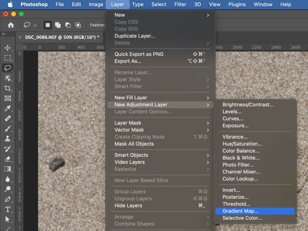
Photoshop will create a new adjustment layer, and the Properties panel will open showing the default gradient settings, which consist of a basic black-to-white gradient.
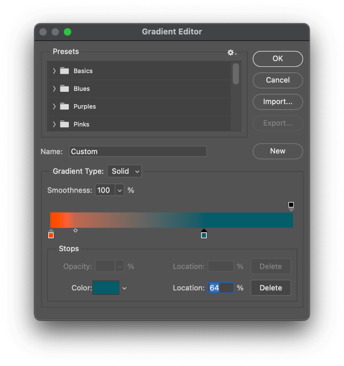
Click on the gradient in the Properties window, and Photoshop will open the Gradient Editor, allowing you to customize the colors and how they are mapped out across your image.
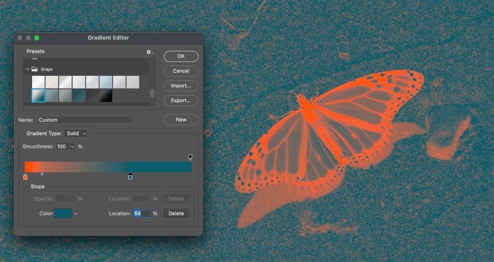
You’ll need to experiment with the settings quite a bit to find something that creates the right effect, but you can get a headstart by selecting one of the preset gradients in the Presets section at the top of the Gradient Editor window.
Gradient editing is standardized across Photoshop, so you’re probably already familiar with how the editor works.
Each of the color swatches represents a pure color in the gradient, and selecting each swatch (known as ‘stops’ in the gradient) allows you to customize the color, its position in the gradient, and how quickly it transitions into the next color.
This can be a very counterintuitive process at first, but you’ll quickly get the hang of it as you explore the different color options available to you. Once you’re satisfied with the results, click the OK button to close the Gradient Editor, and you’re done!
A Final Word
That’s almost everything there is to know about duotones in Photoshop! For most situations, you’ll be able to use the Gradient Map method to create unique and striking graphics, but if you’re creating a Duotone image for print work, you’ll need to take the plunge and actually use the Duotone color mode.
Happy duotoning!
About Thomas Boldt