Blue is blue, right? Then why is it that when you create designs for your business and print them out, the blue tones don’t look quite the same? It seems like no matter how hard you try, the colors end up a little off.
Hey there, I’m Cara! I’m here to tell you there is an easy solution to your problem. That’s always nice to hear, right?
There is a color-matching system called the Pantone Matching System you can use to get consistent colors across printed materials. The only thing you need is the right color code. So let’s look at how to find the Pantone color in Photoshop!
Note: I use the Windows version of Photoshop. If you are using a Mac, the workspace will look slightly different from the screenshots displayed here.
What is the Pantone Matching System?
First, let’s look at this system a little closer. Why does it exist and what is the benefit of using it?
You’re probably aware that computer monitors don’t display colors exactly the same. Look at the same file on two different screens and you will note slight color changes between the two.
Furthermore, computer screens aren’t as sophisticated as our eyes. Your eye can see more color nuances than the screen can provide. So a shade of blue you’re looking at on the screen can print with more greens or other hues that you couldn’t see on the screen
You can see how this would be a problem when working on designs for your business whose colors are supposed to match.
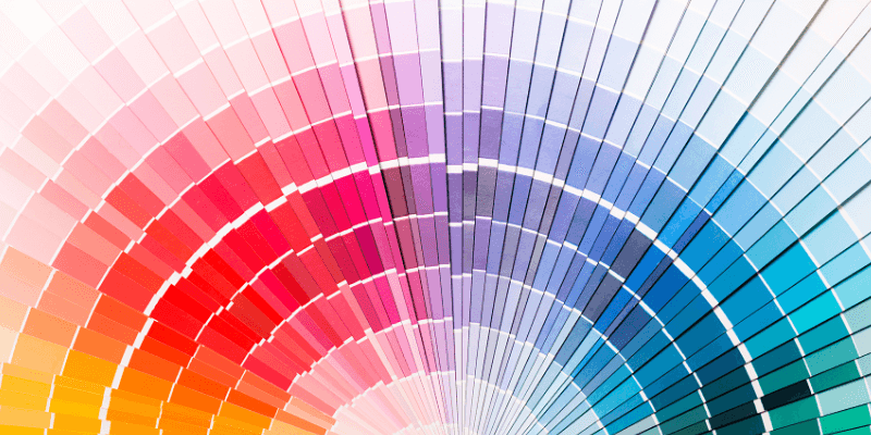
Thus, in 1963 Lawrence Herbert created the Pantone Matching System with the unfortunate initials PMS. He assigned a multi-digit number to the colors to identify specific shades. While there are many shades of teal between blue and green – there is only one Pantone 7472.
How to find Pantone Color in Photoshop?
Working with Pantone colors in a design in Photoshop isn’t too complicated. The color swatch box pretty much gives you what you need.
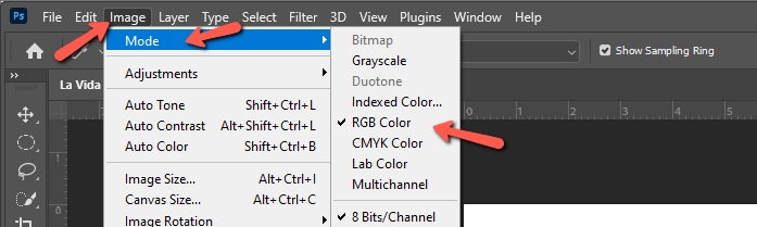
First, however, you need to make sure your image is in RGB color mode in Photoshop. CMYK is usually used for printing in Photoshop, but we need to change the color mode to RGB to find the Pantone colors and be able to match them to another image.
Go to Image and hover over Mode. If RGB doesn’t have a checkmark next to it, click it to switch.
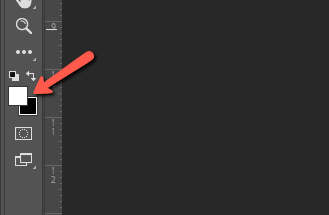
With that out of the way, let’s take a look at the Pantone color. Click on either the foreground or background color swatch at the bottom of the toolbar on the left. This will switch you to the Color Picker tool automatically and open the Color Picker window.
You’ll notice that your cursor has turned into a little eye-dropper icon. Click on the color in your image that you want to match. Photoshop will select that exact shade in the color picker window.
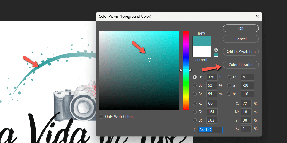
To see the Pantone colors, you need to click the Color Libraries button. Make sure you choose PANTONE+ Solid Coated from the dropdown menu. Below that, you’ll see the closest Pantone colors listed.
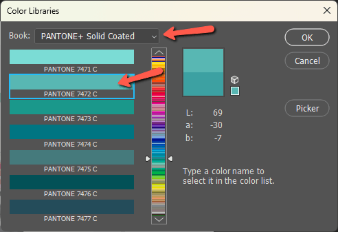
Choose the one you want and click OK. When you go back to your image, you can use the Paint Bucket Tool to change the colors and match them to the specific Pantone color. Or you can open a second image to specifically match the colors in the new image to your original.
Armed with these color codes, you can now ensure that your colors show consistently across all your printed materials! Curious about how to change and match colors in Photoshop? Check out 4 techniques to match colors in Photoshop here!
About Cara Koch