
How do photographers create a certain mood in their photographs? One way is through color grading.
Hey there! I’m Cara and if you’re ready to move beyond basic editing and turn your photos into masterpieces, this tutorial is for you!
Today we’re going to look at what is color grading in Photoshop and how to use it!
Note: I use the Windows version of Photoshop. If you are using a Mac, the workspace will look slightly different from the screenshots displayed here.
Table of Contents
What is Color Grading?
Put simply, color grading is a technique that involves manipulating the color tones of an image for the purpose of creating a certain mood. Blues can make an image moodier whereas yellows make it brighter and more cheerful.
When you color grade an image, you’ll be adjusting not only the hues but also the saturation and luminosity of the colors.
It is extremely easy to go overboard when color grading and make images that look unnatural. However, when done well, color grading is the cherry on top for many images.
There are various ways to manipulate color in Photoshop. Each will give you a slightly different result and you may prefer to work with one technique over another. We’ll cover each of them here so you can experiment with each to find what fits your style best.
Color Correction vs Color Grading
But before we jump in, let’s clarify color correction vs color grading. Color correction uses many of the same techniques, but the goal is to fix a color cast in the image to restore how the scene actually looked in real life.
The goal of color grading is slightly different. While you usually still want to produce a natural-looking image, you are also purposefully adding color tones that weren’t in the original scene to create a certain mood.
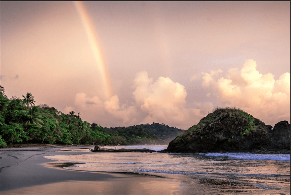
Now let’s get to the good stuff. We’ll work with this image that I took on Playitas Beach here in Costa Rica. I’ve already added a few basic edits to the image, but now let’s look at color-grading it in Photoshop.

Color Grading in Camera Raw Filter
If you’ve used Lightroom a lot, you may find this first technique familiar. If you have yet to discover the Camera Raw filter in Photoshop, check out this tutorial. This filter is perfect for Lightroom users who might be wishing they had access to a certain Lightroom tool while working in Photoshop.
So let’s open the filter. Go to Filter in the menu bar and choose Camera Raw Filter or press Shift + Ctrl + A or Shift + Command + A.

Photoshop will then open the photo up in a new workspace that looks very similar to what you’ll see in Lightroom. Check out the panels on the left. For this tutorial, we’re looking for the one that conveniently says Color Grading.
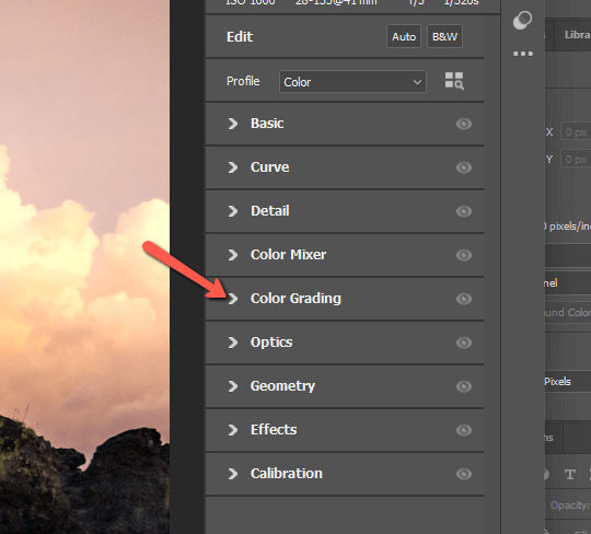
Click the arrow to the left to open the panel. You’ll see three color wheels and a handful of sliders.

Each wheel will add color tones to the image. You can choose to add these tones to either the highlights, the midtones, or the shadows, depending on which wheel you choose.
The Blending slider near the bottom controls how well the highlights, midtones, and shadows blend together. Bringing this slider up will create a more seamless blend.
The Balance slider controls how much of the image is treated as highlights and shadows. Bring this slider up and the definition of highlights broadens. Thus, your changes are applied to more of the image. And vice versa with the shadows if you bring this adjustment down.
You can add literally any color you want to the highlights, midtones, or shadows. It’s generally best to start with either the highlights or the shadows. Adjusting the midtones is often not even necessary (though the option is handy for color correction).
Simply grab the circle in the middle and drag it in the direction of the color you want. The farther out you drag the circle, the stronger the color becomes.
Dragging the circle can be a pain so once you get the hue you want, hold Shift to drag it in a straight line until you get the intensity you want.
There are many ways to color grade, but a common technique is to add orange or yellow to the highlights and blues to the shadows. This intensifies the look that is already present in many images because sunlight is yellow and shadows tend to be more blue.

It’s very easy to go overboard here, so apply these color tones with a light hand. To toggle back to the original image and see your changes, press the Backslash \ key or click the button at the bottom right of the image.
Selective Color Adjustment Layer
The next option is to use the Selective Color adjustment layer. You’ll find it at the bottom of the menu that appears when you click on the half-filled circle icon at the bottom of the Layers panel.

This tool can be confusing, but it is a very powerful help once you understand how it works. In the dropdown menu at the top, you can choose which color channels you would like to target. You can also target the whites, neutrals, and blacks of the image.
So, if you want to work with the yellows in an image, you would choose the yellow channel.

The sliders beneath each control two colors. Slide to the right to add the color that is listed, and slide to the left to add its opposite. This is part of the confusion because you have to know which color is the opposite as it is not listed. So here’s a quick cheat sheet:
- Red – Cyan
- Green – Magenta
- Blue – Yellow
- White – Black
At the bottom, you’ll see two radio buttons marked as Relative and Absolute. Relative makes your changes relative to the colors that are already present. Thus the result is usually less intense.
Absolute adds exactly how much color you’re adding without considering the colors already present. This usually results in a more intense effect.
This tool is wonderful because it gives you very precise control when color grading. Whereas using the Camera Raw filter adds colors based on luminosity, this tool allows you to target only certain colors.
A great example in my image is that to add more intense green to the trees, the shadowy sand would be also affected in Camera Raw. But in Selective Color, I can select the green channel and only affect the parts of the image that are already green – the trees.
However, you do have to understand how to use Selective Color to get the results you want. Check out our tutorial for a deeper dive into this powerful adjustment layer.
Color Balance
The Color Balance tool kind of works like the Color Grading that we used in Camera Raw. However, it has different limitations and freedoms, which may help or hurt you depending on the changes you want to make.
The Color Balance tool is also an adjustment layer, so you’ll find it at the bottom of the Layers panel. Choose Color Balance from the menu that opens when you click the half-filled circle icon.

At the top, you can choose whether you want to work with Highlights, Midtones, or Shadows.

Then, you have three slider options. Without the wheel, you are a little more limited in the hues you can choose. However, you can adjust each of the three sliders for each of the luminosities, whereas Color Grading is limited to one hue for each luminosity.
You can also check the Preserve Luminosity box so that the perceived luminosity of the image doesn’t change as you manipulate the colors.
Here’s what I got by adding a bit of yellow and red to the midtones and you can see my settings for the Highlights on the right.

Hue/Saturation Adjustment Layer
There is one other technique that really allows you to target certain colors in an image. It is also an adjustment layer, so let’s grab it from the adjustment layer menu at the bottom of the Layers panel.

At the top of this panel, you can choose Master to affect the whole image or individual color channels.
If you’re not sure which channel to choose, you can click the little hand with the pointer finger. Then click on the exact spot in the image you want to affect and Photoshop will choose the correct channel for you.

You can also choose a specific color range you want to affect by adjusting the range at the bottom of the panel.

Once you have your color channel, you have a few options for adjusting the colors. The Hue slider controls the specific color and the Saturation controls the intensity of that color. Lightness affects luminosity.
So let’s say I wanted to work with those greens in the trees. I chose the Greens channel, but then I also widened the range a little down into the yellows because the trees contain a lot of yellows.
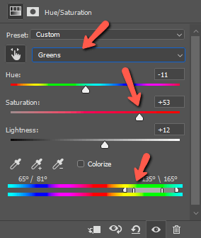
Then I chose the hue I wanted and brought up the saturation. This helps make those trees really pop!

So there you have it, four ways to color grade images that allow you different types of precision for choosing your colors.
Color grading is a big topic and it takes a while to get a feel for how it works. Play around with it on some of your favorite images to see how they turn out. Once you get a technique you like, you’ll find it can do some amazing things to your images!
Curious about other ways to take your editing to the next level? Check out how to use the powerful Curves tool here.
About Cara Koch