
Picture time! Yes, your smiling faces are the stars of the show. However, what you wear to your family photo shoot will have a huge impact on the overall look of your photos.
As a professional photographer, I want every one of my photos to be awe-inspiring, portfolio-worthy images. Realistically, however, some sessions are a little “meh” to my artistic eye. To be clear, this doesn’t happen because of how my clients look, but how they are dressed.
There are two important concepts to keep in mind when choosing clothing for a family photo shoot. The colors of everyone’s outfits need to go together as well as work with the environment you will be shooting in.
You’d be surprised how often people miss one or both of these marks.
To ensure your photos turn out amazing, read on for a few guidelines and ideas on how to coordinate!
Table of Contents
Coordinate, Not Match
The key to gorgeous family photos is coordination. Matching outfits are (thankfully) a trend of the past. However, you do want your clothes to coordinate. If people choose clashing colors or styles, it brings discord to the image rather than the harmony you’re looking for.
How do you coordinate?
A simple method is to pick a color scheme. Choose two or three colors and then have everyone wear those colors. The outfits don’t have to be the same, just make use of the same colors.
Be careful not to overrepresent a color or choose two bold colors that compete with one another.
An easy way to think of it is to use the 60-30-10 rule of interior decorating. Pick the main color that should make up 60% of your clothing. The next color should represent only about 30%. The final color, usually your bold or bright accent color, should only account for about 10%.
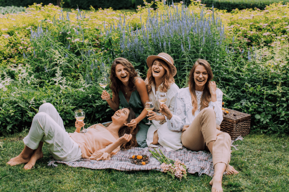
These ladies chose lovely, soft colors that mesh well with the spring garden location of their shoot.
A Word About Prints and Patterns
Prints and patterns on clothing are fun and some people really love expressing themselves through what they wear. As you might imagine, prints and patterns can easily overwhelm the image, especially if multiple people are wearing multiple patterns.
That doesn’t mean that nobody can wear a pattern. However, prints and patterns should definitely be limited.
A good way to incorporate them is to have one person wear a pattern. Perhaps the mom or the little girl wears a floral dress while the rest of the family wears neutral tones.
The predominant color in the pattern should still fall in your color scheme. Another member or two can wear a small accessory to match the color but don’t go too crazy.
I should note here that when I’m talking about a pattern, I mean something like flowers or plaid. Graphic tees and that kind of thing really don’t belong in family photos unless that is part of your intent.
I once had a family show up where the mom and the two little kids were super adorable but the dad was wearing a Homer Simpson T-shirt. Needless to say, he didn’t blend well with the rest of the family.
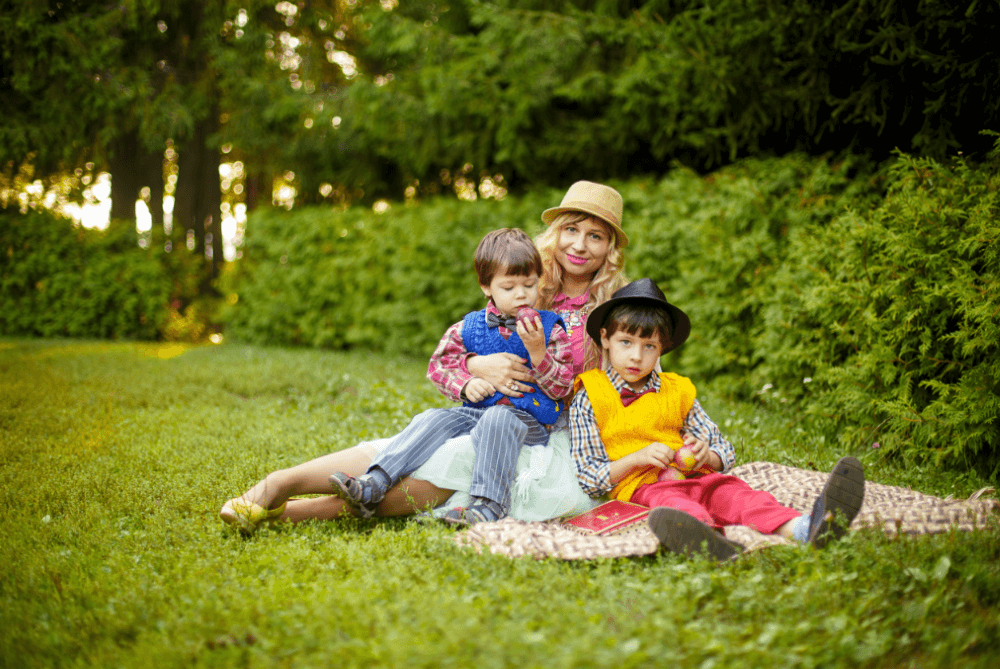
This image is fun and funky and this family probably loves it. However, there are way too many patterns and colors going on here. Notice how the image feels disharmonious?
Neutral Colors
The easiest way to coordinate is to have everybody wear neutral colors. White, beige, cream, black, gray, and anything in that range is great to use as a base color. They are all easier to coordinate than fuchsia, bright purple, or red.
If you’re following the 60-30-10 rule, choose neutral colors for your main two. The third one can be a soft shade of pink, blue, or yellow. Or you can use it as a bright, bold statement color.
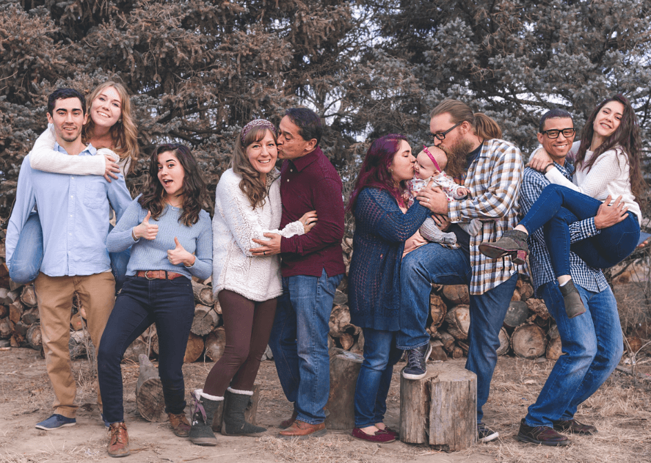
This family did quite well for such a large group. The two guys in plaid are competing a bit, but overall they did great! The style of their clothing also jives well with the location.
A Pop of Color
Of course, everyone in the picture doesn’t have to wear completely neutral colors. You can choose one person’s outfit to provide a fun pop of color.
However, as we mentioned in the patterns section, only one person should wear this bright color. You don’t want the two outfits competing and overpowering the image.
Choose your pop of color wisely. Super bright colors don’t always turn out the same in a photograph as they look in real life. They can also be distracting and pull the eye away from the subject’s face.
It’s also possible for bright, neon colors to leave a color cast on the subject’s skin. If you don’t want a sickly green cast on your skin, stay away from neon green or other strong, bright colors.
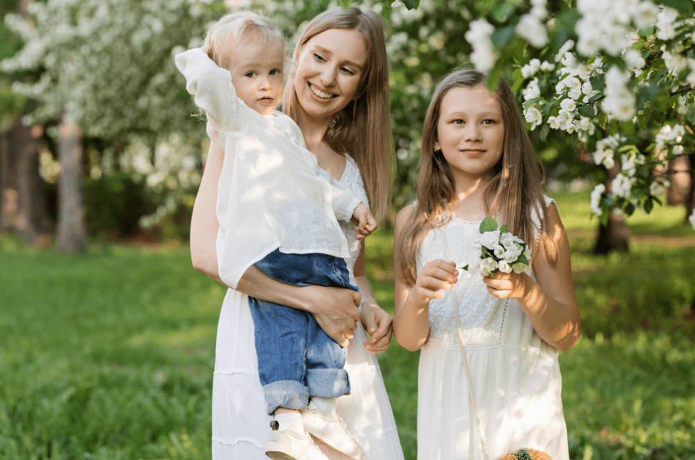
When in doubt, keep it simple like this family. White or white with blue jeans is a great choice that works with every location.
Season and Location
Another thing to consider when choosing your colors for an outdoor photoshoot is the location. Are you going to be on the beach? In a green or yellow field? In the woods? In the tan/brown desert?
If you’ll be shooting in a place with a lot of green, avoid green in your color scheme. A better idea would be to choose light colors like white or cream so that your subjects will stand out from the foliage, but won’t overwhelm the image.
The colors of an environment in the same location can vary significantly depending on the season. Is it fall and all the trees are on fire? Is there white winter snow on the ground? Is it spring and the flowers are in full bloom?
Wearing white in the snow will make it hard to see your subjects. However, white would look lovely if you are shooting in a spring garden.
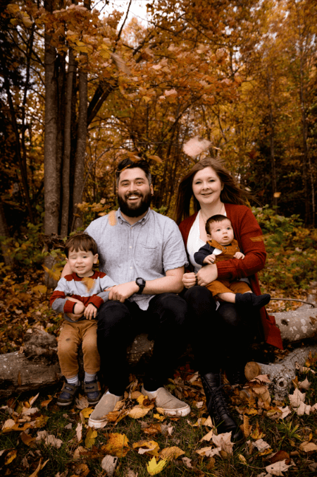
This family coordinated their look to match the warm tones of the fall leaves. They blend with the environment beautifully, but not so much that they get lost.
Color Scheme Ideas
Feeling like you’ve got the basic idea but having trouble deciding on your colors? Here are some best colors to wear for pictures outdoors.
- Tan and white
- Navy, white, and yellow
- Red, gray, black
- Blush, white, and cream or tan
- Light blue, tan, white
- Denim, tan
- Denim, yellow, and white
- White, gray, teal
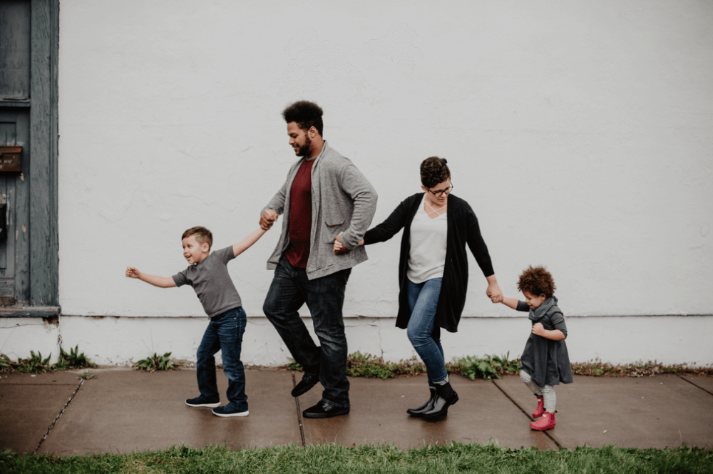
This family did well sticking with mostly black and grays. The little girl’s boots and the dad’s shirt add a nice pop to make things interesting.
Enjoy Your Family Photoshoot!
We hope this gives you an idea of how to dress your family for your next photo shoot. But don’t stress about it too much. The point of a photoshoot is to enjoy time together and photograph your family as it is at this point in time.
The memories you make are more important than the clothes you wear!
Interested to learn more about photography and the wonderful world of Photoshop? Check out how you can turn your family portrait into a drawing in this tutorial!
About Cara Koch