
Typography is so important for a good design. Besides choosing a nice font, you’ll also need to play with the spacing to get the best legibility and appearance.
Working as a graphic designer for more than ten years, whenever I design a poster and work with text in Photoshop, I adjust the spacing of letters and text.
Take logo design as an example, for a standard text logo, the first step I do is play with the spacing. Right, I do that even before changing the font. When I’m happy with the spacing, then I elaborate it with a pretty font, nice colors, and maybe some bold text, and add my personal touch.

In this tutorial, you will learn how to adjust kerning in Photoshop in four simple steps along with some useful tips.
Keep reading.
Table of Contents
4 Quick Steps to Kern Text in Photoshop
If you’re wondering what kerning means, Kerning is the process of changing the amount of white space between letters. You can easily adjust the kerning of your text from the Character panel in four steps to improve readability.
Note: Screenshots are taken from the Adobe Photoshop CC version. Windows or other versions might look slightly different.
Step 1: Select the Type Tool from the toolbar or use the T key to activate it.
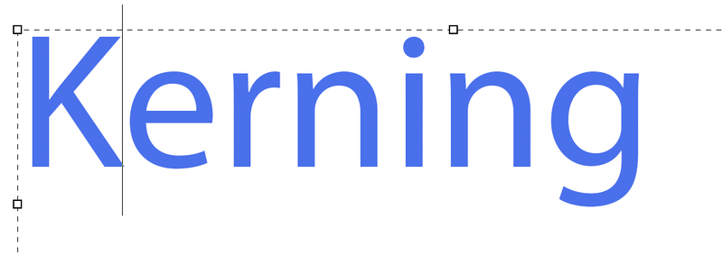
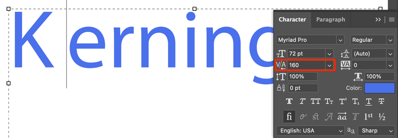
Step 2: Click between the two letters that you want to change the white space. In this case, I want to adjust the white space between the letters K and e.
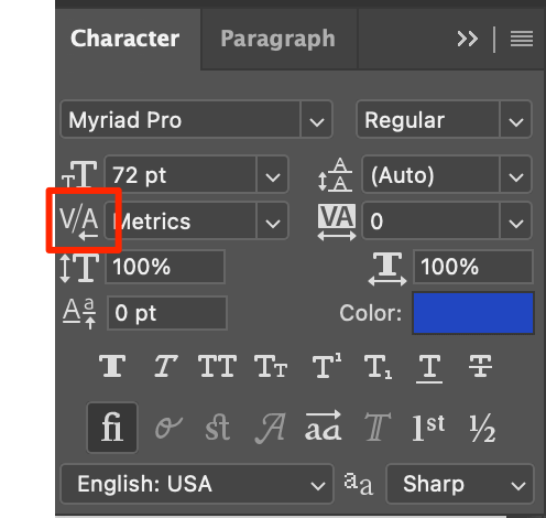
Step 3: Find the V/A icon on the Character panel.
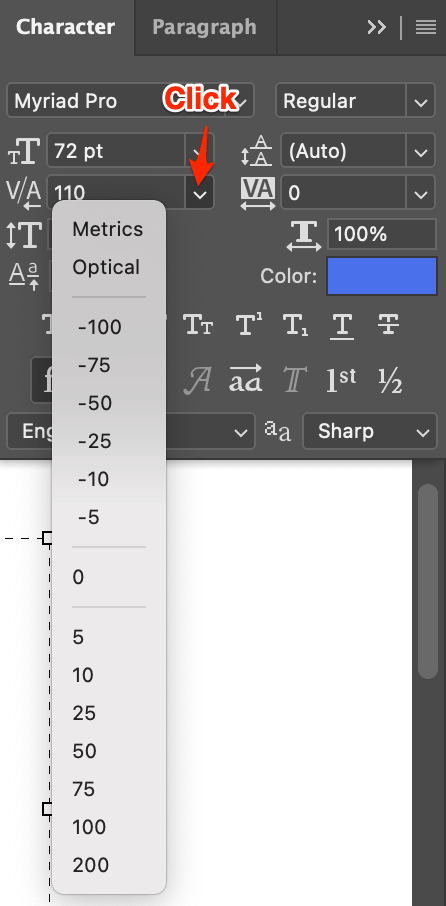
Step 4: Click and choose a value from the dropdown menu or type in the value.
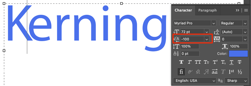
A positive value means adding white space, and a negative value means reducing white space between the letters.
For example, I chose -100, the white space between letters K and e reduces so they stick close together.
Tips: Can’t get exactly what you want? Here’s a trick. Hover your mouse over the A/V icon, you’ll see this pointer cursor icon. Move left to reduce and move right to increase the kerning (white space).
For example, I dragged right to get the value 160 (which is not an option from the dropdown menu).
Or you can use the keyboard shortcut for a slight adjustment. Hold the Option key (Alt on Windows) and press the left (to reduce) or right (to increase) arrow keys to adjust kerning.
FAQs
You might also be interested to know the answers to the following questions related to kerning text in Photoshop.
What are the types of kerning?
When you click on the kerning icon, you see the options: Metric, Optical, and some numbers, right? Actually, there are three types of kerning: metric, optical, and manual.
Metric is the one we generally use for adjusting white space between specific pairs of letters. Optical is used to kern text based on the letter shapes. And we can kern text manually to satisfy specific needs.
What is the difference between leading, kerning, and tracking?
Leading, kerning, and tracking are all processes to manipulate the spacing of the text. But each one of them is in charge of a specific function.

Leading adjusts text space vertically between paragraphs or multiple lines of text. Tracking adjusts the spacing of the entire text (a group of letters), and kerning adjusts the space between two specific letters.
What is bad kerning?
Bad kerning equals bad readability, especially when it comes to body text content. Either too much or too little white space in between letters can affect readability.
Bad kerning can also lead to misunderstanding. So it’s really important to adjust the kerning. For example, the word “kerning” itself. In some font, you can easily read it as “keming”, right?
Conclusion
Can’t talk about typography without mentioning text spacing, and kerning plays a big role in it. Whether you are designing a logo or trying to make text content more readable, adjusting kerning and other character spacing are the keys.
And remember the bad kerning examples? Avoid that 🙂
About June
Amy
great tutorial, super easy to follow and very helpful!! THANK YOU!
Lee
Thanks so much! This is so helpful to know. Before I would just start a different text layer so that I had control over the spacing between letters.
Aaron Smith
Thank you very much for the article!!
Any way to adjust the kerning in the TTF file? For instance, in my particular font, it looks very good but the spacing is very wrong for dashes.
Thanks.
fersy
very helpful tutorial! thank you very much!
Bob Littleroot
I really appreciate this tip. I had been doing similar things in Premiere for video titles but could not find it in Photoshop. Thank you.
sarah
I am using adobe caslon pro and trying to set the title of a book on the spine (in photoshop). I want to add some space between the letters for readability. The “Th” in the word “The” seems to have a hard kerning pair that can not be over-ridden – the two letters basically touch. I have tried to adjust this with the letter spacing tool, and with individual kerning. Nothing works. Except to have it all caps – which I was trying to avoid.
Any suggestions?