
If you’re a graphic designer, you might say, I don’t know anything about 3D design. Well, maybe you do and you actually don’t have to use the 3D tool. Photoshop is not best known for creating a 3D design, but it is a great tool for making 3D text effects.
In this tutorial, you will learn how to create a 3D text effect in Photoshop with and without the 3D tool.
Table of Contents
2 Ways to Make 3D Text in Photoshop
If you’re not familiar with 3D designs, it might bit a bit overwhelming to use the 3D interface all of a sudden. Considering that, I’ve included a method that doesn’t require the 3D tool to create a 3D text effect in Photoshop.
Let’s get started with the easier option.
Note: the screenshots are taken from Adobe Photoshop CC Mac version. Windows other versions might look different. Windows users change Command to Crtl key and Option to Alt key.
Method 1: Without the 3D Tool
Step 1: Create a Photoshop document, select the Type Tool from the toolbar, and add text on the canvas.
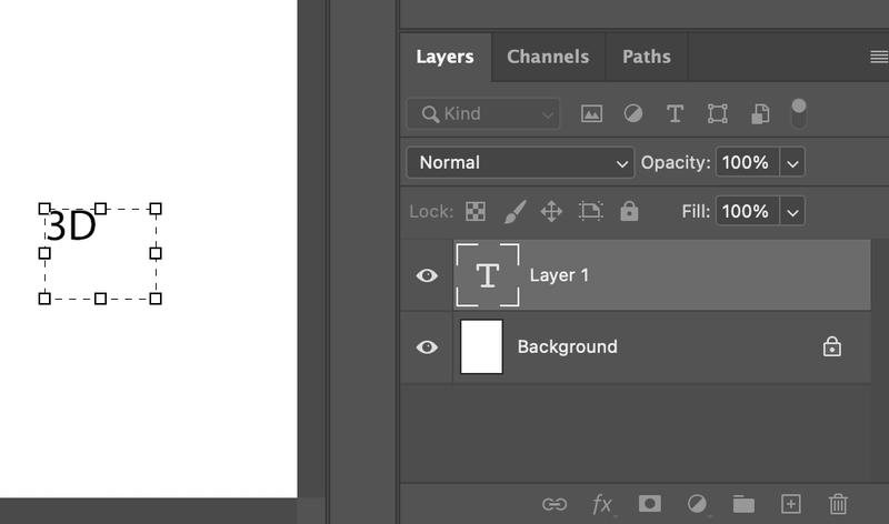
Tip: I suggest using a bold font because it will better show the 3D result.
Step 2: Duplicate the text layer (3D) and drag the duplicated layer (3D copy) up to the left.
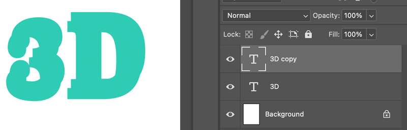
Step 3: Change the 3D layer text color to a darker color because it’s going to be the “shadow”.
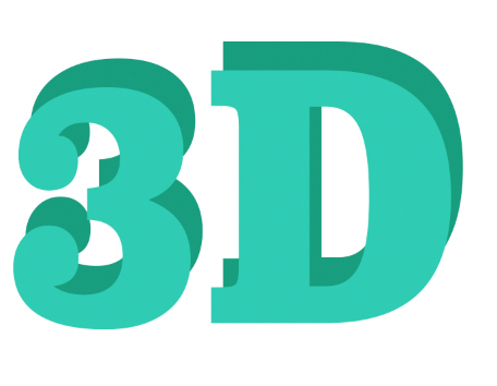
It’s starting to get the 3D feeling, but as you can see that the two layers are not connecting very well. We are going to use the Lasso tool to fill the gaps between the two layers of text, but before that, the text layer should be rasterized.
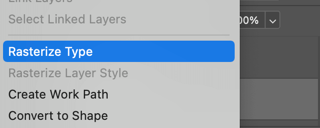
Step 4: Select the 3D (text) layer from the Layers panel, right-click and select Rasterize Type.
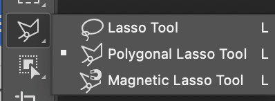
Step 5: Select the Polygonal Lasso Tool and start working on the text overlapping parts.
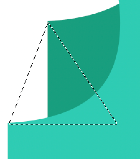
Click to start the first anchor point, and click to cover the areas that you want to fill with the “shadow” color, in this case, the darker green. Remember you’re working on the bottom (3D) text layer.
Hit the keyboard shortcut Option + Delete to fill it with the foreground color. Your foreground color should be the same color as the “shadow” color.
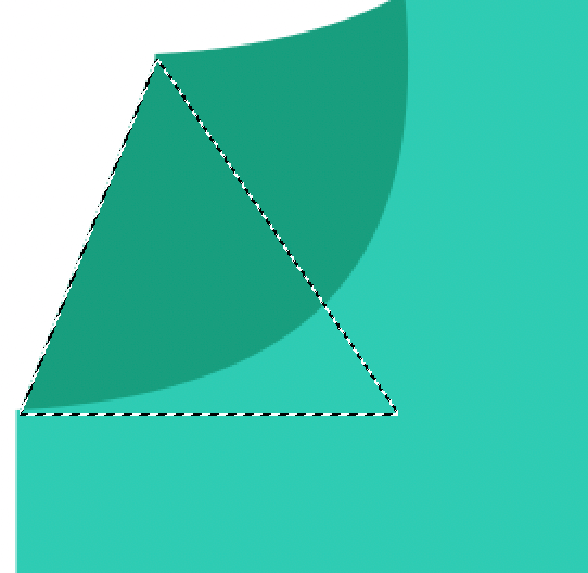
You can see that now the gap is filled, hit the Command + D keys to deselect. Repeat the same for all gaps.
In the curve areas, it might be more complicated. You can use the Pen Tool to draw a selection, then right-click and choose Make Selection.
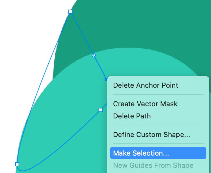
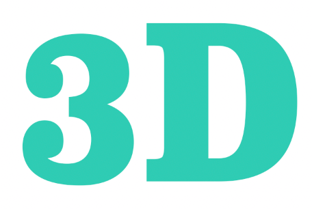
And use the Option + Delete keys to fill. The final result would look something like this.
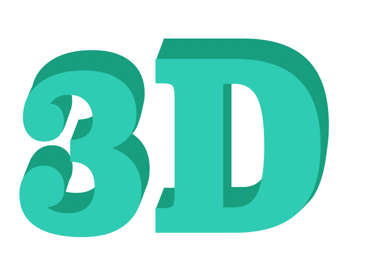
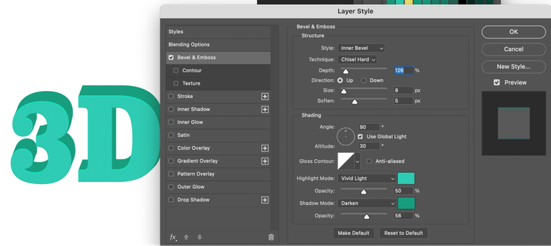
If you want to add some effect to it, you can merge the layers, or add layer styles.
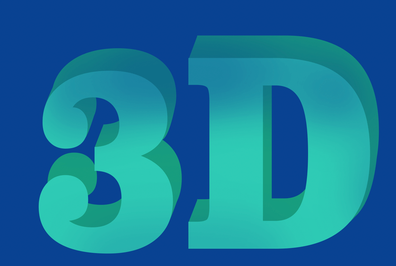
You can also add a layer mask to give it a bit of a blend effect.
Method 2: Using the 3D Tool
Although Adobe decided to discontinue Photoshop’s 3D feature, you can still use the existing 3D tools.
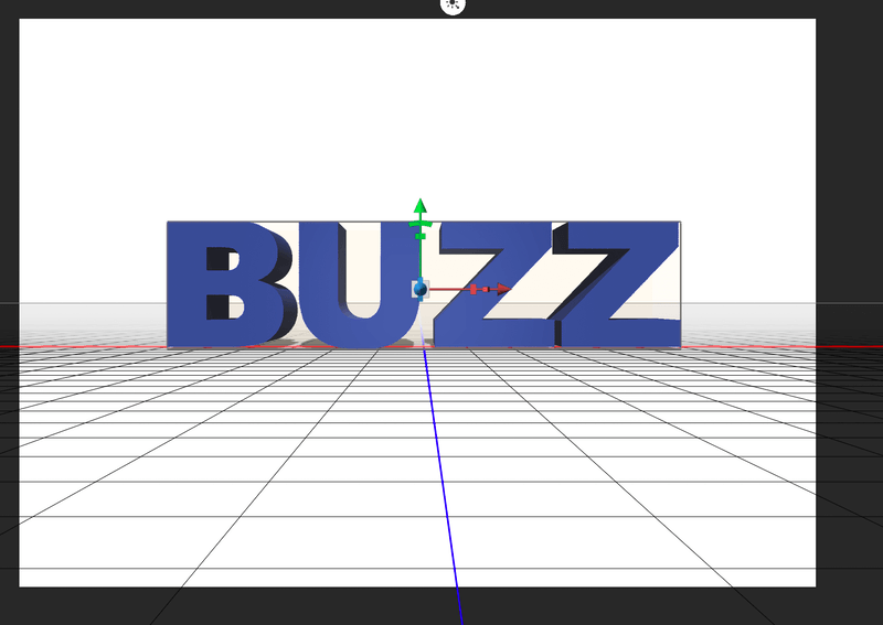
Step 1: Create a new document and type on the canvas. Same as the method above, I would recommend using a bold font and changing the text color if you’d like.

Step 2: Go to the top menu and select 3D > New 3D Extrusion from Selected Layer.
Now your workspace should look like this.
Step 3: Go to the Properties panel and select Coordinates. Set the X value to 90 degrees angle.
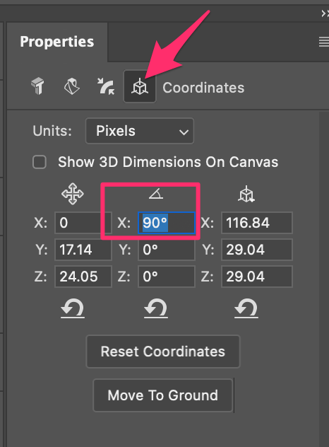
Now the canvas would look like this. You’ll need to rotate the camera to see the text.
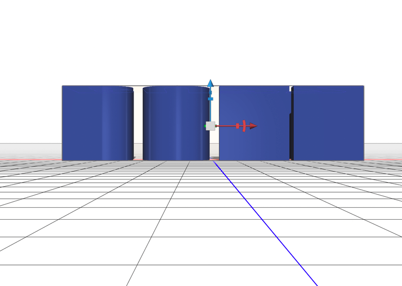
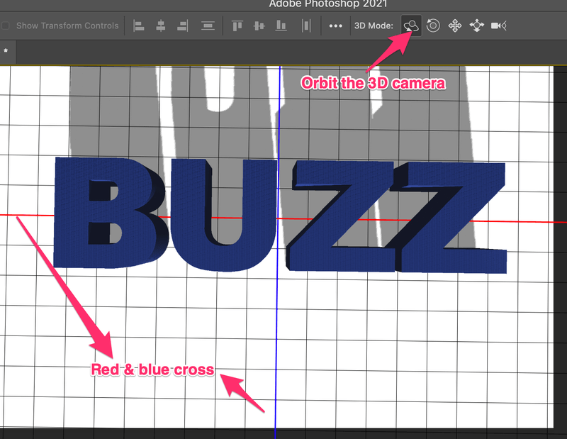
Step 4: Select Orbit the 3D Camera option from the top toolbar, click on the canvas, bring the text back to the front and when you see the red & blue crossing, stop right there.
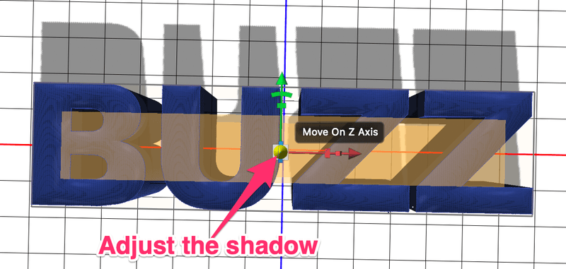
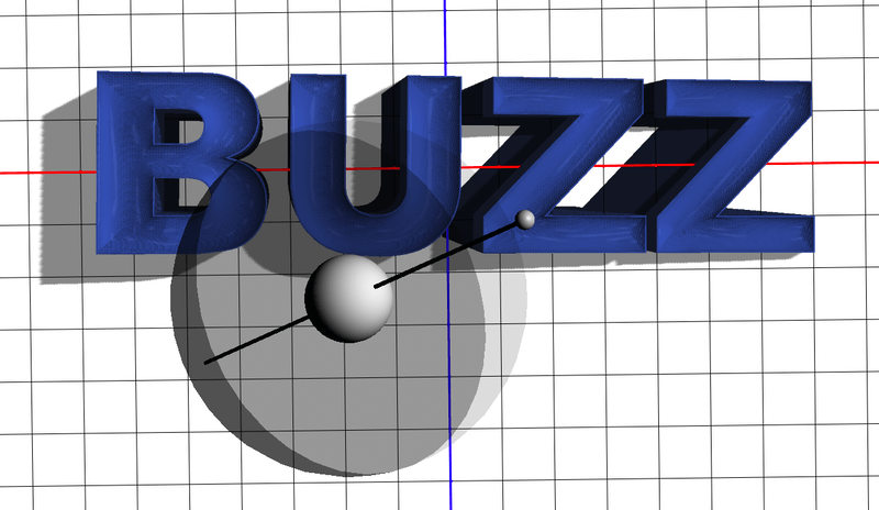
As you can see that the shadow is quite far. You can click and drag the axis at the center of the text to adjust the shadow. You can see how the shadow is a shorter distance from the text.
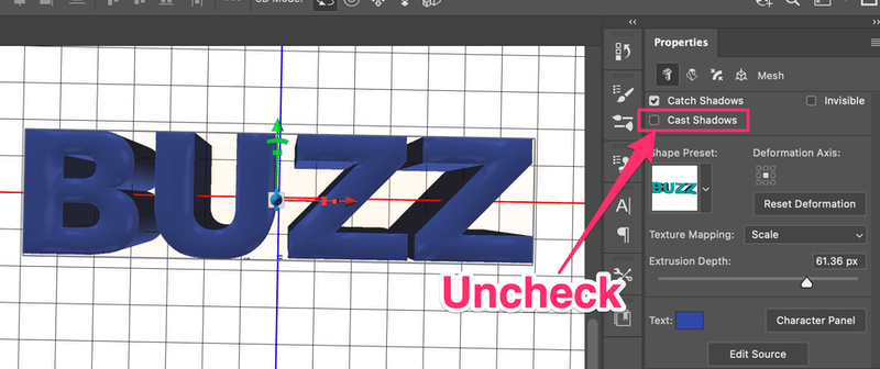
If you want to remove the shadow. Unlock the Cast Shadow box in the Properties panel.
Basically, you’ve created the 3D text already, but there are more effects you can add to it and I’ll show you a couple in the next steps. If you’re happy with how it is, go straight to Step 8 to render the 3D effect.
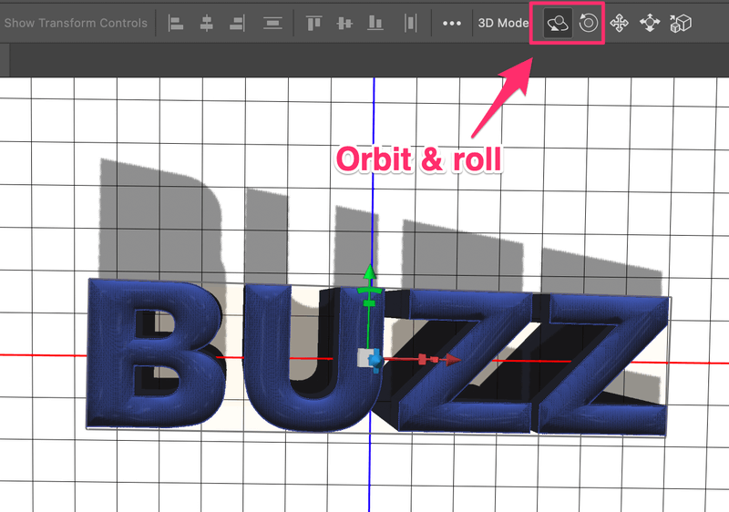
If you simply want to reposition the text, click on the canvas to roll or orbit the camera to a different angle.
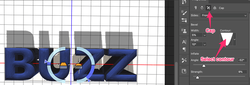
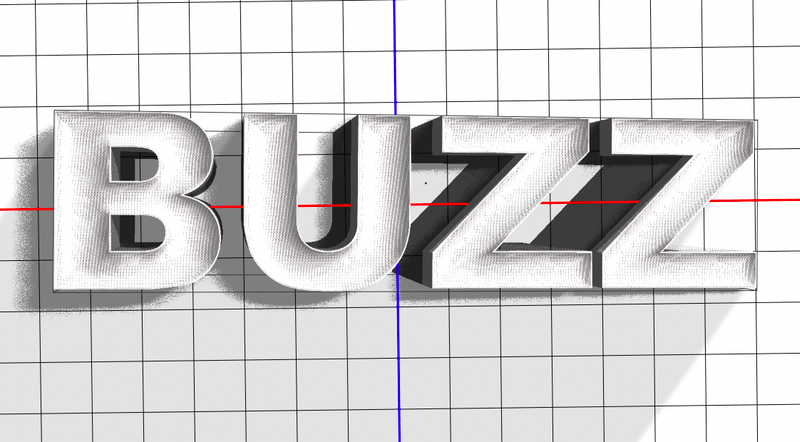
Step 5 (Optional): Select the Cap option from the properties panel. You can add a contour and bevel to the text.
Maybe the shadow looks a bit unnatural right now. You can also add some lighting to the text.
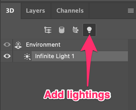
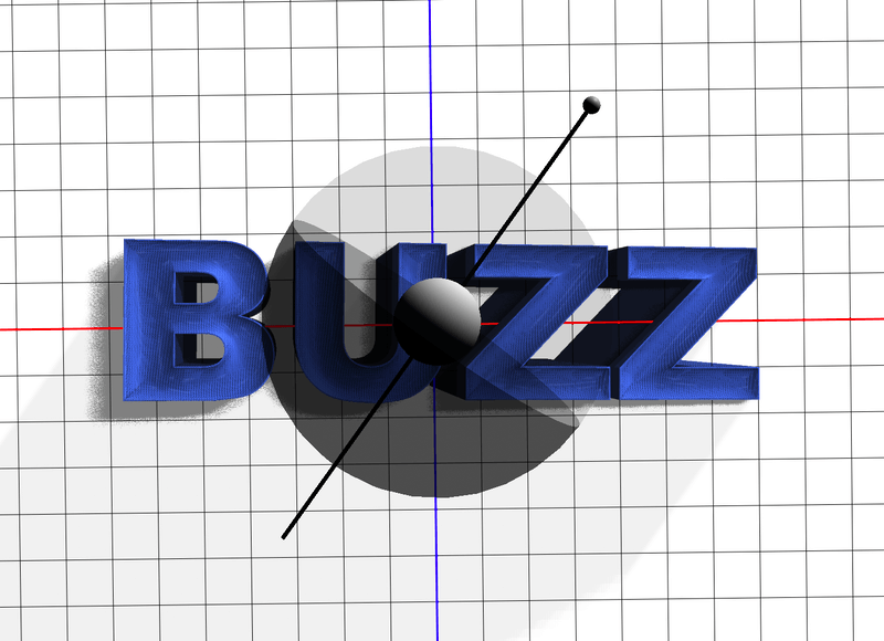
Step 6 (Optional): Click on the Filter By: Lights option on the 3D panel.
Click on the handle to adjust the light source, and you can move the circle to choose an angle.
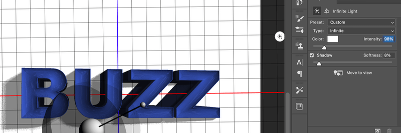
On the Properties panel, you can change the lighting style, color, intensity, and shadow style.
If you want to add another light source, go back to the 3D panel and select New Infinite Light at the bottom of the panel.
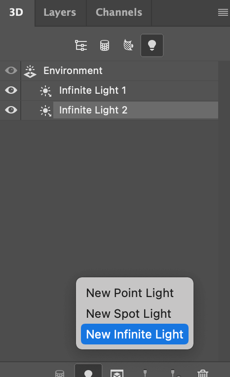
I’ve added a larger shadow light. It might not look very obvious now, but I’ll add a background to the text later on and you’ll see 🙂
Step 7 (Optional): You can also change the color and material of the text. Go to the 3D panel and click on the Materials icon. Select all options, and go to the Properties panel to change color or materials.
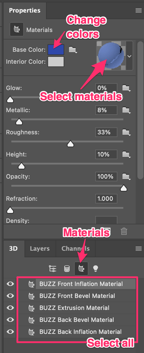
For example, I’ve changed the material and color of my text.
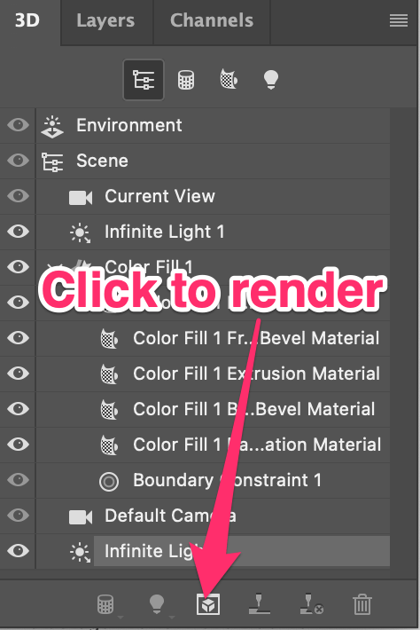
Step 8: Click on the Render button to render the 3D effect. It might take a while to render, so if your Photoshop gets stuck, don’t freak out 🙂
That’s pretty much it. Now you can go back to the Layers panel and add a background to the 3D text and see how it looks.

Conclusion
You can make 3D text with or without the 3D tool in Photoshop. It all depends on how 3D you need the design to look. Of course, the 3D tool gives you more options to edit and achieve a more realistic 3D look, but for a quick graphic 3D text effect, the imperfect method 1 would work just fine.
About June
Jamsal Friday
Wonderful clue